flowchart LR
  B[Application budget<br/>deadline, payload, loss tolerance] --> L[Measure latency<br/>p50 and p95]
  B --> G[Measure goodput<br/>useful payload per second]
  L --> J[Measure jitter<br/>variation across runs]
  G --> U[Check utilisation<br/>offered load vs capacity]
  J --> Q{Queues growing?}
  U --> Q
  Q -- yes --> C[Reduce offered load<br/>or add capacity]
  Q -- no --> D[Validate margin<br/>under realistic traffic]
30 Lab: Network Performance
networking-core
net
performance
30.1 Start With the User-Visible Delay
Network performance matters when a person, machine, or control loop notices the delay, loss, jitter, or throughput limit. A fast link label is not enough; the useful question is whether the application still meets its promise under real load.
This lab turns performance into evidence. Measure what the application receives, connect it to queues and overhead, then decide whether the bottleneck is capacity, contention, latency, loss, or test design.
Phoebe’s Field Notes: Why 54 Mbps Wi-Fi Measures 12 Mbps on the Floor

Phoebe’s Why
This lab is careful to separate “propagation delay” (a timing cost, measured in nanoseconds per metre, from how fast a wave travels down a medium) from a completely different physical effect that shares the word “propagation”: path loss (a power cost, measured in decibels, from how a wave’s energy spreads and gets absorbed with distance). The knowledge check’s factory Wi-Fi link that measures 12 Mbps instead of its 54 Mbps ceiling is a path-loss story, not a delay story. An 802.11 radio does not pick a data rate by preference; it picks the fastest modulation the measured signal-to-noise ratio can still decode reliably, and a machinery-dense factory floor eats far more signal than empty air, so the radio falls back to a slower, more robust rate long before propagation delay ever becomes the bottleneck.
The Derivation
Free-space path loss from inverse-square power spreading (an isotropic source, ideal receive aperture):
\[\mathrm{FSPL(dB)} = 20\log_{10}d + 20\log_{10}f - 147.55 \quad (d\ \text{in m},\ f\ \text{in Hz})\]
Real indoor and industrial paths lose faster than free space; the log-distance model captures that with a path-loss exponent \(n\) (n = 2 is free space):
\[\mathrm{PL}(d) = \mathrm{PL}(d_0) + 10n\log_{10}\!\left(\frac{d}{d_0}\right)\]
The extra loss obstacles add, relative to free space, at the same distance:
\[\Delta_{\mathrm{obstacle}}(\mathrm{dB}) = 10(n - 2)\log_{10}\!\left(\frac{d}{d_0}\right)\]
Worked Numbers: The Factory Wi-Fi Link
- Free-space loss at 2.4 GHz, 100 m (this chapter’s own reference distance, borrowed from its cable-propagation example): \(\mathrm{FSPL} = 20\log_{10}(100) + 20\log_{10}(2.4\times10^{9}) - 147.55 = 80.1\) dB
- Extra loss from obstruction alone, 20.0 m factory floor: using \(n = 3.30\) (catalog-typical for a machinery-dense NLOS industrial floor, vs. \(n = 2.00\) free space), \(\Delta_{\mathrm{obstacle}} = 10(1.30)\log_{10}(20.0) = 16.9\) dB on top of the free-space number
- What that buys in rate fallback: typical published 802.11g PHY sensitivity figures need about \(-65.0\) dBm to hold 54 Mbps but only about \(-79.0\) dBm to hold 12 Mbps – a 14.0 dB margin difference
- Distance where obstruction loss alone reaches 14.0 dB: solving \(10(1.30)\log_{10}(d) = 14.0\) gives \(d = 11.9\) m – well inside a factory floor, so a fixed access point and a receiver on opposite sides of machinery can lose an entire rate tier from obstruction loss alone, with the AP’s advertised 54 Mbps bandwidth completely unchanged
30.2 Learning Objectives
By completing this lab, you will be able to:
- Differentiate bandwidth from throughput: Explain why a 1 Mbps link may only deliver 100 Kbps of actual data due to protocol overhead and contention
- Measure and interpret latency: Calculate round-trip time (RTT) and decompose its components (propagation, processing, queuing)
- Analyze jitter patterns: Evaluate how latency variation affects real-time IoT applications such as industrial control and sensor fusion
- Demonstrate congestion effects: Apply network simulation to compare packet delivery under normal and overloaded traffic conditions
- Calculate efficiency metrics: Compute goodput as a fraction of total transmitted data and compare protocol overhead ratios
For Beginners: Network Performance
Network performance measures how quickly and reliably data moves between devices. Think of it like measuring traffic flow on a road – you care about speed (how fast cars go), throughput (how many cars pass per hour), and delays (how long you wait at intersections). These same ideas apply when IoT sensors send data to the cloud.
Chapter Roadmap
This lab chapter is long, so use it as a measurement sequence:
- First separate the user-visible delay from the link label, then define bandwidth, throughput, latency, jitter, goodput, and overhead.
- Then use the browser workbench to change offered load, loss, and jitter before you wire any ESP32 hardware.
- Next build the optional ESP32 version in small behaviours: LEDs, packet timing, congestion, loss, and result reporting.
- After that compare measured results with application thresholds and the bandwidth-does-not-cut-latency warning.
- Finally use the review questions, label quiz, and code challenge to prove you can explain the bottleneck with evidence.
Checkpoints recap what you have already proven. Collapsed callouts, code archives, and challenge exercises are deepening material after the main lab path is clear.
Network performance is often misunderstood. Many engineers conflate bandwidth with throughput or assume that higher bandwidth automatically means lower latency. This lab demonstrates through practical ESP32 simulation that these metrics are independent and understanding their relationships is critical for IoT system design.
Overview: Performance Is A Measurement, Not A Link Label
A network is not fast because its label says 1 Mbps, 54 Mbps, or 1 Gbps. It is fast enough only if the measured path delivers the application's useful data within the time, loss, and jitter budget that the IoT job needs. A door sensor, vibration monitor, camera, and control loop can all share the word "network" while having different success criteria.
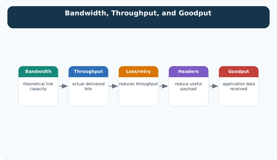
For a learner, the important shift is simple: bandwidth is the ceiling, throughput is what the path actually carries, latency is how long one exchange waits, jitter is how much that wait moves around, and goodput is the part the application can use. Those measurements can move in different directions. A link can have high bandwidth and poor goodput if retransmissions dominate. A link can have acceptable average latency but unacceptable p95 latency if queues occasionally fill. A link can deliver every packet and still fail a control task if the packets arrive after the decision deadline.
This is why the lab starts with a measurement record instead of a speed label. In production IoT work, the same pattern appears across tools: ping can expose round-trip timing, iperf3 can estimate throughput where the endpoints support it, Wireshark can show retransmissions and packet sizes, and MQTT broker logs can show publish timing and disconnects. The tool names are less important than the measurement discipline. State the application budget first, measure the path under a defined load, then decide whether the observed margin is enough for the job.
The overview lesson is that performance is a contract between the application and the path. The path includes radio airtime, wired hops, queues, gateways, brokers, cloud services, and application processing. A good lab makes each part visible enough that students can say which metric failed and why, not just that "the network is slow."
Practitioner: Build The Performance Evidence Record
A useful lab record names the tested flow, the offered load, the measured result, and the decision. For each run, capture packet size, payload size, packet rate, link condition, p50 and p95 latency, jitter range, loss rate, retransmissions, throughput, goodput, and the observed bottleneck. The record should also state the measurement point: device-to-gateway, gateway-to-broker, broker-to-application, or end-to-end. Without that boundary, a timing number cannot explain where the delay came from.
Run at more than one load point. A path that looks healthy at 10 percent utilisation can fail near saturation, and a low average latency can hide p95 delays that break control loops or real-time dashboards. Use a small load ladder instead of a single run: for example, baseline idle traffic, expected normal traffic, expected burst traffic, and a deliberate overload case. Keep the payload and protocol constant while you raise packet rate, then keep the packet rate constant while you change payload size. Changing one variable at a time lets the evidence point to queueing, overhead, or loss instead of mixing all three.
Good practitioner notes use units and denominators. Latency should say milliseconds and whether it is one-way or round-trip. Jitter should say how it was calculated, such as max-minus-min, standard deviation, or p95-minus-p50. Loss should be lost packets over sent packets. Throughput should be total delivered bits per second, while goodput should be useful application payload bits per second. That distinction matters in IoT because protocol headers, acknowledgements, security tags, keep-alives, retransmissions, and padding can all consume airtime without delivering new sensor data.
The final line of the record is the engineering decision. If p95 latency is above the control deadline, the fix may be lower packet rate, smaller payloads, local edge processing, a different radio setting, or a separate traffic class for control messages. If goodput is low but latency is stable, the fix may be packet aggregation, compression, or a protocol with lower overhead for small payloads. If loss rises during bursts, the fix may be backoff, buffering, or admission control. The lab should end with a decision tied to evidence, not a vague recommendation to use a faster network.
Under the Hood: Queues Turn Load Into Delay
When offered load approaches the service rate, packets wait in buffers before they can be transmitted. That queueing delay changes the distribution of latency, not just the average. If buffers overflow, packet loss and retransmissions can add still more load. This is the mechanism behind the common lab observation where everything looks normal for a while, then latency suddenly becomes unstable as the packet rate rises.
The underlying reason is that a queue is a waiting room with a service rate. If packets arrive slower than the link or processor can serve them, the queue drains between arrivals and delay stays bounded. If packets arrive at about the same rate they can be served, small bursts create waiting time. If packets arrive faster than service for long enough, the queue grows until packets are dropped or deadlines are missed. The nominal bandwidth has not changed; the load relative to service has changed.
This is why goodput can fall while bandwidth is unchanged. The physical or radio link still has the same nominal capacity, but overhead, contention, retries, and queueing consume part of the path before useful application bytes arrive. Wireless systems add another layer because contention and retries consume airtime. TCP adds recovery and congestion-control behavior that can reduce send rate after loss. MQTT QoS levels add acknowledgements and state tracking. LoRaWAN adds airtime and duty-cycle constraints. Each mechanism may be correct, but each one changes the useful payload delivered per unit time.
The under-the-hood lesson is to treat averages carefully. Average latency can hide a long tail, and the tail often decides whether an IoT workload is safe. A dashboard may tolerate a late reading; a control loop may not. A temperature logger may survive a dropped sample; a command channel may require acknowledgement, retry, and idempotent receiver behavior. The performance lab connects these internal mechanisms to visible measurements: offered load, queue delay, loss, retransmission, jitter, and goodput. Once students can read those signals together, they can reason about bottlenecks instead of guessing from the link label.
30.3 Key Concepts Explained
Before diving into the lab, review the terminology:
| Metric | Definition | IoT Example |
|---|---|---|
| Bandwidth | Maximum theoretical data rate (bits/second) | LoRaWAN SF7: 5.47 Kbps max |
| Throughput | Actual measured data rate achieved | LoRaWAN real-world: 2-3 Kbps |
| Latency | Time for data to travel from source to destination | MQTT publish: 50-200 ms |
| Jitter | Variation in latency over time | Video stream: +/-15 ms |
| Goodput | Application-layer useful data rate | Sensor reading: 100 bytes/min |
| Overhead | Protocol headers, retransmissions, ACKs | TCP/IP: 40+ bytes per packet |
Large Dataset on a Fast Link
Radio astronomy systems are a useful reminder that “fast” is a relationship between data volume and time. Suppose a telescope archive needs to move a 10 TB data set to a processing site over a dedicated 10 Gbps optical link.
Convert the link first:
\[10 \text{ Gbps} = 10 \times 10^9 \text{ bits/s} = 1.25 \times 10^9 \text{ bytes/s}\]
Using decimal storage units, a 10 TB data set is about \(10 \times 10^{12}\) bytes. The ideal transfer time is therefore:
\[\frac{10 \times 10^{12}\text{ bytes}}{1.25 \times 10^9\text{ bytes/s}} = 8{,}000\text{ s} \approx 2.2\text{ h}\]
If a vehicle can carry the same disks across roughly 700 km in 10 hours, the network link wins for this case even before counting handling time. The lesson is not that networks always beat physical transport. It is that the engineering record must state the units, usable throughput, payload size, overhead, and deadline before deciding which path is actually faster.
Putting Numbers to It
For a LoRaWAN sensor transmitting 12-byte payloads, calculate the protocol overhead and efficiency:
LoRaWAN adds a 13-byte MAC header plus a 4-byte Message Integrity Check (MIC):
\(\text{Total packet size} = 12 \text{ (payload)} + 13 \text{ (MAC)} + 4 \text{ (MIC)} = 29 \text{ bytes}\)
Protocol overhead ratio:
\(\text{Overhead ratio} = \frac{13 + 4}{29} = \frac{17}{29} = 58.6\%\)
Efficiency (useful data / total transmission):
\(\text{Efficiency} = \frac{12}{29} = 41.4\%\)
Compare this to MQTT over TCP/IP with minimum headers (2-byte MQTT fixed header + 20-byte TCP + 20-byte IP):
\(\text{MQTT packet} = 12 + 2 + 20 + 20 = 54 \text{ bytes}\) \(\text{Efficiency} = \frac{12}{54} = 22.2\%\)
For small payloads, LoRaWAN’s dedicated IoT protocol is nearly 2x more efficient than MQTT/TCP/IP, despite LoRaWAN’s encryption overhead. This efficiency gap widens for sub-10-byte sensor readings.
 Checkpoint: Metrics and Evidence
You now know:
- A 1 Mbps link label is only a ceiling; the chapter examples show useful data can fall to 800 Kbps throughput, 600 Kbps goodput, or even 100 Kbps under overhead and congestion.
- Goodput efficiency is useful payload divided by total transmitted bytes, such as 12 / 29 = 41.4% for the LoRaWAN example.
- Latency, jitter, loss, and throughput are separate measurements, so a faster bandwidth number does not automatically fix a deadline miss.
The terms are now precise enough to test. The next step is to move from definitions into a controllable experiment where one slider at a time changes the result.
30.4 Test Before Hardware
Start here before building the ESP32 version. The controls below let you model the same performance ideas directly in the browser: bandwidth, offered load, latency, jitter, packet loss, and goodput.
Optional Hardware Build
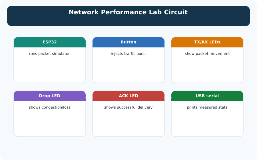
Build this version only after you have tried the browser workbench. The extra hardware makes latency, congestion, and button-triggered tests visible on real LEDs.
| Component | Quantity | Purpose |
|---|---|---|
| ESP32 DevKit | 1 | Microcontroller for network simulation |
| Red LED | 1 | High latency indicator (>200 ms) |
| Green LED | 1 | Low latency indicator (<50 ms) |
| Yellow LED | 1 | Medium latency/transmission active |
| Blue LED | 1 | Congestion detected indicator |
| RGB LED (optional) | 1 | Jitter visualization (color intensity) |
| 220 ohm Resistors | 4-5 | Current limiting for LEDs |
| Push Button | 1 | Trigger network tests |
| 10K ohm Resistor | 1 | Button pull-down |
| Breadboard | 1 | Circuit assembly |
| Jumper Wires | Several | Connections |
Checkpoint: Simulate Before Wiring
You now know:
- Offered load comes from packet size, packet rate, and link bandwidth, and the workbench makes queue delay visible when utilisation rises past the healthy region.
- The optional circuit uses red, green, yellow, and blue LEDs to make latency and congestion observable instead of hidden in a log.
- The hardware path should start after the browser model, so errors in wiring do not hide the performance idea being tested.
30.5 Circuit Diagram
30.6 Optional ESP32 Implementation
Use the ESP32 version after the browser workbench. Build it as a set of small behaviours so students can test each performance idea separately.
| ESP32 piece | What to implement | How to verify it works |
|---|---|---|
| Bandwidth vs throughput | Count total bytes sent and useful payload bytes | Throughput is lower than raw bandwidth when overhead is included |
| Latency profile | Timestamp send and receive events | Serial output reports RTT and LED color follows the delay range |
| Jitter analysis | Record several RTT samples | The result shows variation, not just one average |
| Congestion test | Increase packet rate or background load | Blue congestion LED turns on and queue delay increases |
| Packet loss simulation | Drop a controlled percentage of packets | Results include retransmissions and goodput reduction |
30.7 Step-by-Step Instructions
30.7.1 Step 1: Set Up the Circuit
- Open your preferred ESP32 development environment
- Add an ESP32 DevKit to your workspace or breadboard
- Add 4 LEDs (red, green, yellow, blue) to the breadboard
- Add 4 x 220 ohm resistors for current limiting
- Add 1 push button and 1 x 10K ohm resistor for pull-down
- Connect each LED through its resistor to the specified GPIO pins:
- Red LED: GPIO 2 (high latency indicator)
- Green LED: GPIO 4 (low latency indicator)
- Yellow LED: GPIO 5 (transmission active)
- Blue LED: GPIO 18 (congestion detected)
- Connect button: 3.3V to one leg, other leg to GPIO 15 with 10K pull-down to GND
- Connect all LED cathodes (short legs) to GND
30.7.2 Step 2: Upload and Run
- Start from the ESP32 behaviour map above rather than pasting one large program.
- Implement one performance feature at a time: latency LED, throughput counter, jitter samples, congestion flag, then packet loss.
- Compile and run after each feature so errors stay easy to isolate.
- Open the Serial Monitor at 115200 baud and compare each result with the browser workbench.
30.7.3 Step 3: Observe the Demonstrations
The simulator automatically cycles through educational demonstrations:
- Bandwidth vs Throughput: Explains why actual data rate differs from link capacity
- Latency Concepts: Shows components of round-trip time
- Jitter Analysis: Demonstrates timing variation effects
- Congestion Effects: Simulates network overload
- Full Performance Test: Runs complete measurement cycle
30.7.4 Step 4: Run Manual Tests
Press the button to trigger a full network performance test at any time. Each test:
- Sends 20 simulated packets
- Measures latency for each packet
- Calculates jitter (standard deviation)
- Simulates varying congestion levels
- Reports comprehensive statistics
30.8 Expected Output
When running the simulation, the Serial Monitor should report a readable measurement sequence:
| Stage | Serial monitor should show | What the LEDs should do |
|---|---|---|
| Startup | Lab title, GPIO setup, and LED self-test status | Each LED blinks during self-test |
| Network setup | Simulated bandwidth, base latency, queue size, and packet loss | LEDs turn off after setup |
| Ready | Prompt to press the button or wait for automatic cycles | All LEDs idle |
| Demo cycle | The current topic: bandwidth, latency, jitter, congestion, or full test | LED color matches the measured condition |
| Manual test | Packet count, RTT samples, goodput, and packet-loss summary | Blue LED turns on if congestion is detected |
| Result | Performance rating and recommended tuning action | LEDs reset before the next cycle |
Checkpoint: ESP32 Measurement Record
You now know:
- A complete test sends 20 simulated packets, records RTT samples, counts retransmissions, and reports packet loss before grading the run.
- The chapter’s code separates propagation delay, processing delay, queueing delay, and jitter instead of hiding them inside one average.
- Build the ESP32 lab one feature at a time: latency LED, throughput counter, jitter samples, congestion flag, then packet loss.
With a local measurement loop in place, the remaining question is where the delay should be removed. The next explorer connects this same RTT breakdown to edge, fog, and cloud placement.
30.9 Challenge Exercises
Measure Real Wi-Fi Performance
Modify the code to measure actual network performance instead of simulation:
- Connect the ESP32 to your Wi-Fi network
- Send HTTP requests to a known server (like httpbin.org)
- Measure actual round-trip time using
millis() - Compare simulated results to real-world measurements
Hint: Use WiFi.h and HTTPClient.h libraries. The key insight is that real networks have much more variable latency than our simulation.
Add Adaptive Bitrate Simulation
Implement adaptive transmission similar to video streaming:
- Monitor current network conditions (latency, loss rate)
- If conditions degrade, reduce payload size (lower “quality”)
- If conditions improve, increase payload size
- Display quality level changes on Serial Monitor
Hint: Create quality levels like “High (500 bytes)”, “Medium (200 bytes)”, “Low (50 bytes)” and switch based on measured performance.
Implement Congestion Control
Add TCP-like congestion control to the simulator:
- Implement slow start: Begin with small transmission rate
- Implement congestion avoidance: Gradually increase rate
- On packet loss: Cut rate in half (multiplicative decrease)
- Visualize the congestion window (CWND) changes
Hint: Research TCP Reno’s AIMD (Additive Increase Multiplicative Decrease) algorithm.
Challenge 4: Multi-Sensor Competition
Simulate multiple IoT sensors competing for network resources:
- Create 5 virtual sensors, each trying to send data
- Implement a simple TDMA (time division) scheduler
- Compare performance with and without scheduling
- Show how fair queuing improves overall throughput
Hint: Use an array of sensor structures and cycle through them with different scheduling algorithms.
30.10 Troubleshooting
| Problem | Solution |
|---|---|
| LEDs not lighting | Check resistor values (220 ohm) and GPIO pin assignments |
| No Serial output | Ensure baud rate is 115200 in Serial Monitor |
| Button not responding | Verify 10K pull-down resistor and button wiring |
| Simulation freezes | Reduce delay times in code; ESP32 may need reset |
| Results seem random | This is intentional – jitter simulation includes randomness |
30.11 IoT Application: Why This Matters
Understanding these metrics is critical for real IoT deployments:
| Application | Key Metric | Threshold | Why |
|---|---|---|---|
| Industrial sensors | Latency | <100 ms | Control loop stability |
| Video surveillance | Throughput | >2 Mbps | Image quality |
| Medical devices | Jitter | <20 ms | Consistent readings |
| Smart meters | Goodput | >90% | Data completeness |
| Voice assistants | Latency | <150 ms | Natural conversation |
| Fleet tracking | Packet loss | <1% | Position accuracy |
The table gives the application deadlines; the warning below explains why buying more bandwidth may still leave those deadlines missed.
Bandwidth Does Not Cut Latency
The Mistake: “We upgraded from 100 Mbps to 1 Gbps, so our IoT sensor latency should decrease 10x.”
Why It’s Wrong: Bandwidth (bits per second) and latency (time per packet) are independent metrics. Propagation delay (speed of light) and processing delay dominate IoT latency, not transmission time.
The Numbers:
100-byte packet at 100 Mbps: transmission time = 8 microseconds
100-byte packet at 1 Gbps: transmission time = 0.8 microseconds
Savings: 7.2 microseconds
Propagation delay (100 m cable): 500 nanoseconds (fixed)
Processing delay (router): 50-500 microseconds (fixed)
Queuing delay (congestion): 1-100 milliseconds (dominant factor)
Total latency: ~10-150 milliseconds, where 7.2 microseconds is negligible
The Fix: To reduce latency, minimize hops, reduce congestion, use UDP instead of TCP, or move processing closer to sensors (edge computing). Bandwidth upgrades help throughput, not latency.
Checkpoint: Application Decision
You now know:
- Industrial sensors care about latency under 100 ms, video surveillance needs more than 2 Mbps throughput, and medical devices care about jitter under 20 ms.
- A 100-byte packet saves only 7.2 microseconds when moving from 100 Mbps to 1 Gbps, so queueing and processing usually dominate the IoT delay budget.
- A strong recommendation names the measured bottleneck – loss, jitter, throughput, retransmissions, or queueing – and ties the fix to that evidence.
30.12 Concept Review
Common Pitfalls
Measure Under Real Load
Networks often perform well at 10% capacity but degrade sharply at 70–80% utilisation. Fix: measure performance at multiple load levels (10%, 30%, 50%, 70%, 90%) and identify the saturation point.
Report Percentiles, Not Averages
An average latency of 50 ms looks acceptable, but a 99th-percentile latency of 5 seconds is unacceptable for real-time control. Fix: always report p50, p95, and p99 latency alongside the mean.
Control Background Traffic
Other devices sharing the channel during measurements add uncontrolled variability. Fix: run performance measurements in a controlled environment with no other active devices on the channel, or explicitly measure and subtract background traffic.
30.13 Summary
This lab demonstrated the critical network performance metrics through hands-on simulation:
- Bandwidth vs Throughput: Maximum capacity differs from actual achieved data rate due to protocol overhead, contention, and retransmissions
- Latency Components: Propagation, processing, queuing, and transmission delays combine to produce the round-trip time
- Jitter Impact: Variation in latency affects real-time applications more than average latency alone
- Congestion Effects: Overloaded links cause exponential latency increases and can trigger congestion collapse
- Efficiency Metrics: Goodput measures useful application data as a fraction of total transmitted data
30.14 Knowledge Check
30.15 What’s Next
| Topic | Chapter | Description |
|---|---|---|
| Packet Simulator Lab | Packet Simulator Lab | Build and inspect packet structure hands-on, calculate checksums, and observe error detection in action |
| TCP Fundamentals | TCP Fundamentals | Understand how TCP congestion control (slow start, AIMD) manages throughput and prevents congestion collapse |
| Transport Protocol Comparison | Transport Protocol Comparison | Compare TCP vs UDP tradeoffs for latency-sensitive vs reliability-sensitive IoT applications |
| MQTT QoS and Sessions | MQTT QoS and Sessions | Apply QoS levels 0, 1, and 2 to prioritize critical sensor data and manage delivery guarantees |
| Network Topology Design | Topologies Fundamentals | Evaluate how mesh, star, and tree topologies affect latency, jitter, and fault tolerance in IoT deployments |
| Edge and Fog Computing | Edge/Fog Introduction | Reduce network latency by processing sensor data closer to the source with edge computing patterns |
30.16 Key Takeaway
Performance labs should measure throughput, latency, loss, jitter, retries, and bottlenecks under changed conditions. A single successful transfer does not prove network capacity.