This lab starts with behavior you can observe and record. Treat each run as evidence: what state appeared, what feedback changed, which modality helped or failed, how long the response took, and what the design should do differently next time.
Putting Numbers to It
Lab execution time can be estimated before starting runs:
Worked example: With 5 runs and per-run times of 4 min setup, 6 min execution, and 3 min review, total lab time is \(5\times(4+6+3)=65\) minutes. This prevents under-scoping and helps schedule complete experimental cycles.
This calculator helps you plan lab sessions realistically. For example, with typical times (4 min setup, 6 min execution, 3 min review) and 5 runs, you need 65 minutes—not the 30 minutes a naive estimate might suggest.
In 60 Seconds
This hands-on lab uses the Wokwi ESP32 simulator to build an accessible IoT interface featuring menu navigation with multimodal feedback (visual OLED display, audio buzzer tones, LED blinks), high-contrast and large-text accessibility modes, and persistent user preferences stored in non-volatile memory – all demonstrating core accessibility design principles without requiring physical hardware.
Chapter Roadmap
This is a long lab, so use this path through it:
First size the lab run and define the evidence you need from each interface test.
Then connect the ESP32 controls, OLED, buzzer, and LED to a menu design question.
Next build the accessible Wokwi interface and verify each feedback channel.
After that compare the lab results against accessibility testing, priority, and retrofit risks.
Finally extend the design with audit, voice-over, auto-repeat, and status-pattern challenges.
Checkpoint callouts recap what you have already proved; longer code and challenge sections are places to slow down, run the simulator, and record evidence before moving on.
29.2 Learning Objectives
By completing this lab, you will be able to:
Design Accessible Menus: Build hierarchical navigation that works for users with varying abilities
Implement Multimodal Feedback: Configure visual, audio, and tactile confirmation of user actions
Apply High Contrast Design: Demonstrate color and contrast patterns that meet WCAG 2.1 accessibility standards
Configure User Preference Storage: Implement persistent accessibility settings using non-volatile storage (NVS)
Implement Diverse Input Methods: Build button navigation for users who cannot use touchscreens
Evaluate Glanceable Displays: Assess whether interfaces are readable at a glance with clear visual hierarchy
Hands-On Interface Lab
This hands-on chapter lets you practice UX design skills for IoT through exercises and real scenarios. Think of it as art class where you actually draw instead of just studying art theory. Working through these design exercises builds practical skills you can apply to your own IoT projects.
Key Concepts
Interaction Design: Discipline defining how users communicate with digital systems through input, output, and feedback mechanisms.
Multimodal Interface: System accepting input and delivering output through multiple channels (touch, voice, gesture, haptic) simultaneously.
User Testing: Structured observation of representative users attempting defined tasks, exposing interface problems invisible to designers.
Prototype Fidelity: Level of detail in a prototype: low fidelity (paper sketch) validates concepts; high fidelity (interactive mockup) validates usability.
Information Architecture: Structural design of digital spaces to support usability and findability, determining where content lives and how users navigate.
Cognitive Load: Mental effort required to use an interface; IoT systems must minimise cognitive load for users managing many connected devices.
Usability Heuristic: Principle-based rule for evaluating interface quality (e.g. Nielsen’s 10 heuristics) without requiring user testing.
29.3 Prerequisites
Basic understanding of Arduino/C++ syntax
Familiarity with interface design principles from previous chapters
No physical hardware required (browser-based simulation)
29.4 Lab Tests Feedback
This lab is about checking whether an embedded interface communicates clearly through more than one channel. The ESP32, SSD1306 OLED, navigation buttons, buzzer, status LED, and Wokwi simulator are the testbed. The design question is whether a user can navigate, confirm, recover, and preserve accessibility preferences without relying on one fragile cue.
Treat each run as an interface test. When you press Up, Down, Select, or Back, check the display state, tone pattern, LED blink, serial log, and saved setting. A menu action is not complete until the user can tell what happened, the device state is consistent, and the next action is clear.
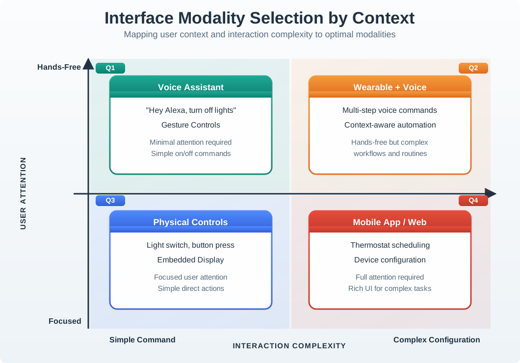
Figure 29.1: The lab focuses on the physical-control and embedded-display quadrant, then adds audio and status-light feedback so one channel does not carry the whole accessibility burden.
State: menu location, selected item, preference value, and online/status message must be visible or audible.
Feedback: navigation, selection, back/cancel, error, success, and toggle events should have distinguishable patterns.
Persistence: high contrast, large text, sound, and brightness choices should survive a restart through ESP32 Preferences/NVS.
The lab is successful only if the evidence covers several user situations. A person looking directly at the OLED should see menu position and preference state. A person glancing from a distance should still notice the status LED. A person who cannot read the screen should hear whether a setting was enabled or disabled. A maintainer should be able to inspect serial output and saved preferences after a restart. Those checks turn the exercise from “the code compiles” into an accessibility review.
A practical acceptance test is to hand the simulator to someone who did not write the code, ask them to change one preference, restart the device, and explain the current state using only the cues they noticed. Any hesitation points to a feedback, language, or recovery gap.
Checkpoint: Test Evidence
You now know:
This lab is not just a wiring exercise; it asks whether a user can navigate, confirm, recover, and preserve preferences.
Evidence must cover OLED state, tone pattern, LED blink, serial output, and saved settings.
A successful run ends with a design decision, not only a working sketch.
29.5 Measure Interaction Loop
The next step turns that acceptance idea into a repeatable loop. Instead of pressing buttons casually, treat each menu action as a measured run with expected and observed results.
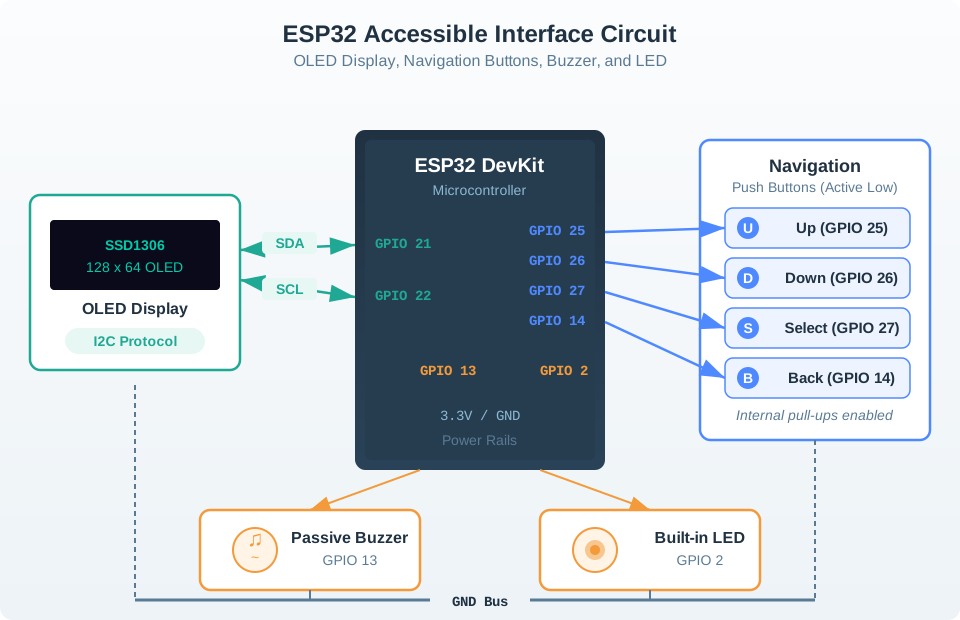
Use Wokwi as a repeatable lab bench. Confirm the I2C wiring for the SSD1306 display on GPIO 21/22, active-low button inputs on GPIO 25/26/27/14 with internal pull-ups, buzzer output on GPIO 13, and status LED on GPIO 2. Then run task scripts such as “enable high contrast,” “increase brightness,” “turn sound off,” and “return to Home without losing position.”
Record what the simulator shows and what the serial monitor reports. Useful evidence includes debounce behavior around the 200 ms window, tone frequency patterns for enable/disable, menu wraparound, OLED readability in normal and large-text modes, brightness dimming, and NVS values after restart. If a user must remember a hidden mode, the interface is doing too much work in the user’s head.
Use a simple run sheet rather than free-form notes. For each task, write the starting menu, button sequence, expected OLED text, expected tone, LED blink pattern, serial event, saved preference key, and observed mismatch. Repeat at least one task with sound muted and one task with large text enabled, because those modes change what counts as adequate feedback. If Wokwi behavior is used as evidence, label which parts still need physical validation: real button bounce, buzzer volume, OLED viewing angle, enclosure placement, and power draw.
Run the task: start from Home, complete one accessibility change, and return to the previous screen.
Check all channels: verify OLED text, LED blink count, buzzer tone, serial log, and saved preference.
Record the gap: note any ambiguous state, missing confirmation, hard-to-read display, excessive delay, or accidental double press.
A good lab record ends with a design decision. Examples include keeping the 200 ms debounce window, shortening a tone that blocks input too long, adding a confirmation label beside a toggle, or moving brightness recovery into the top-level menu. Each decision should include the evidence that justified it and the hardware condition that would require a bench recheck. ## Embedded UI Shapes Accessibility {.depth-l2}
The code decisions in this lab are interface decisions. INPUT_PULLUP changes the button’s electrical behavior and makes pressed read as LOW. The debounce delay changes whether rapid presses feel responsive or create accidental repeats. tone() and blocking delay() calls can make audio feedback clear, but they can also pause input handling if overused. SSD1306 text size and display contrast decide whether the interface is glanceable at 128x64 pixels.
Preference storage is part of the UX contract. ESP32 Preferences writes to non-volatile storage so high contrast, large text, sound, and brightness settings survive power cycles. That improves accessibility only if the saved state is applied before the first meaningful screen and if the user can still recover when a setting makes the interface less usable.
Timing: compare debounce, audio duration, display refresh, and human reaction time.
Failure: test display-init failure, muted sound, low brightness, repeated button presses, and restart after saved settings.
Transfer: before building hardware, identify which simulator assumptions need bench validation: button bounce, buzzer volume, OLED visibility, enclosure placement, and power draw.
The simulator hides some physical risks. Real switches bounce differently from Wokwi buttons, real buzzers have volume and frequency limits, and an OLED that is readable on a monitor may be hard to read behind a plastic window or at an installed angle. The under-the-hood review should therefore keep separate columns for simulated evidence and bench evidence. Wokwi can validate state logic, menu routing, preference persistence, and serial instrumentation, but it cannot close enclosure, acoustics, accessibility reach, or battery-runtime questions.
Those boundaries matter when the lab becomes a product pattern. If a later device uses an interrupt-driven input handler, different display library, haptic motor, or asynchronous audio driver, the interface evidence must be retested. The user promise is not “the sketch ran”; it is that every important state has a clear, recoverable, multimodal cue under realistic timing and failure conditions.
Checkpoint: Simulator Boundaries
You now know:
Wokwi is strong evidence for menu routing, state logic, preference persistence, and serial instrumentation.
Bench validation is still needed for bounce, buzzer volume, OLED viewing angle, enclosure placement, and power draw.
The saved accessibility state must be applied before the first meaningful screen, or persistence becomes confusing rather than helpful.
29.6 Lab: Build an Accessible IoT Interface
Now build the interface. Keep the same evidence mindset while you copy the circuit, code, and diagram: every line exists to make a user-visible state clearer through at least one channel.
This hands-on lab uses the Wokwi ESP32 simulator to build an accessible IoT interface with menu navigation, visual feedback on an OLED display, audio feedback via buzzer, and user preference storage.
29.6.1 Components Used
Component
Purpose
Connection
ESP32 DevKit
Main microcontroller
Central board
SSD1306 OLED 128x64
Visual display output
I2C (GPIO 21 SDA, GPIO 22 SCL)
Push Button (Up)
Menu navigation up
GPIO 25
Push Button (Down)
Menu navigation down
GPIO 26
Push Button (Select)
Menu selection/confirm
GPIO 27
Push Button (Back)
Return to previous menu
GPIO 14
Passive Buzzer
Audio feedback
GPIO 13
LED (Status)
Visual status indicator
GPIO 2 (built-in)
29.6.2 Key UI/UX Concepts in This Lab
Accessibility Design Principles
This lab demonstrates core accessibility concepts:
Multimodal Feedback: Every action produces visual (OLED + LED), audio (buzzer), and timing-based feedback
High Contrast Mode: Toggle between standard and high-contrast display modes for users with visual impairments
Adjustable Text Size: Switch between normal and large text modes for readability
Audio Confirmation: Distinct sound patterns for navigation, selection, errors, and confirmation
Progressive Disclosure: Show only relevant options at each menu level to reduce cognitive load
Persistent Preferences: Save user accessibility settings so they persist across power cycles
Debounced Input: Handle button bouncing to prevent accidental double-presses
29.6.3 Circuit Diagram
Figure 29.2: Circuit diagram showing ESP32 connected to SSD1306 OLED display via I2C, four navigation buttons on GPIO pins, a passive buzzer for audio feedback, and built-in LED for accessible IoT interface lab
29.6.4 Wokwi Simulator Environment
About Wokwi
Wokwi is a free online simulator for Arduino, ESP32, and other microcontrollers. It allows you to build and test IoT projects entirely in your browser without purchasing hardware. The simulator supports OLED displays, buttons, buzzers, and other components needed for this accessibility-focused UI lab.
Launch the simulator below to get started:
Simulator Tips
Click the + button to add components (search for “SSD1306”, “Button”, “Buzzer”)
Connect wires by clicking on pins
Use internal pull-up resistors for buttons (configured in code)
The Serial Monitor shows debug output and accessibility events
Press the green Play button to run your code
Test both high contrast and standard display modes
29.6.5 Step-by-Step Instructions
29.6.5.1 Step 1: Set Up the Circuit
Add an SSD1306 OLED Display: Click + and search for “SSD1306”
Add a Passive Buzzer: Click + and search for “Buzzer”
Wire the components to ESP32:
OLED Display (I2C):
OLED VCC -> ESP32 3.3V
OLED GND -> ESP32 GND
OLED SDA -> ESP32 GPIO 21
OLED SCL -> ESP32 GPIO 22
Navigation Buttons (active LOW with internal pull-up):
UP Button: One leg to GPIO 25, other leg to GND
DOWN Button: One leg to GPIO 26, other leg to GND
SELECT Button: One leg to GPIO 27, other leg to GND
BACK Button: One leg to GPIO 14, other leg to GND
Audio Feedback:
Buzzer (+) -> ESP32 GPIO 13
Buzzer (-) -> ESP32 GND
29.6.5.2 Step 2: Understanding the Menu Structure
Before copying the code, understand the accessible menu system:
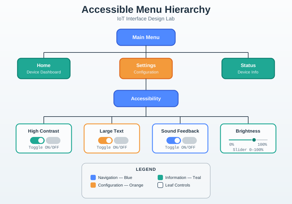
Figure 29.3: Menu hierarchy diagram showing main menu with Home, Settings, and Status options, where Settings expands to Accessibility submenu containing High Contrast toggle, Large Text toggle, Sound toggle, and Brightness slider options
29.6.5.3 Step 3: Copy the Accessible Interface Code
Copy the following code into the Wokwi code editor (replace any existing code):
Press the green Play button to start the simulation
Observe the home screen showing device status
Press SELECT to open the main menu
Use UP/DOWN to navigate between options
Press SELECT on “Settings” to access accessibility options
Toggle High Contrast - notice the inverted display colors
Toggle Large Text - see the text size increase
Toggle Sound - hear different tones for each action
Adjust Brightness - cycle through brightness levels
Press BACK to return to previous menus
29.6.6 Learning Points
After the simulator runs, step back from the mechanics and read the result as an interaction pattern. The important question is which cue carries which state, and what happens when one cue is unavailable.
Key UI/UX Concepts Demonstrated
Multimodal Feedback Design:
Action
Visual
Audio
Timing
Navigation
Menu highlight moves
800Hz beep
LED blink
Selection
Screen updates
Rising tone
LED blink
Toggle ON
Value shows [ON]
Ascending tones
LED blink
Toggle OFF
Value shows [OFF]
Descending tones
LED blink
Back
Previous screen
400Hz tone
LED blink
Error
Error message
Double low beep
Triple LED blink
Accessibility Features Implemented:
High Contrast Mode: Inverts display colors for users with low vision. White background with black text provides maximum contrast ratio (~21:1).
Large Text Mode: Increases text size from 1x to 2x for improved readability.
Audio Feedback: Distinct tones for different actions help users who cannot see the display clearly. Ascending tones indicate positive actions, descending tones indicate going back or disabling features.
Persistent Preferences: Settings are saved to NVS (Non-Volatile Storage) and automatically restored on power-up.
Button-Based Navigation: Physical buttons work for users who cannot use touchscreens. Internal pull-up resistors simplify wiring.
Debouncing: 200ms debounce delay prevents accidental double-presses, important for users with motor control difficulties.
Design Patterns Used:
Progressive Disclosure: Only relevant options shown at each menu level
Consistent Navigation: Same buttons always perform same functions
Status Indicators: Visual feedback shows current state at all times
Error Prevention: Menu wrapping prevents “out of bounds” navigation
29.6.7 Challenge Exercises
Extend Your Learning
Try these modifications to deepen your understanding of accessible interface design:
Challenge 1: Add Haptic Feedback Patterns Modify the buzzer code to create distinct vibration-like patterns (rapid tone sequences) that convey different meanings.
Challenge 2: Implement Voice-Over Simulation Add Serial output that “announces” the current menu item and its state when navigation occurs. This simulates screen reader functionality.
Challenge 3: Add Auto-Repeat for Held Buttons Implement a feature where holding UP or DOWN buttons automatically scrolls through menu items at increasing speed.
Challenge 4: Create Color-Coded Status LEDs Add RGB LED support to show different status colors (green = normal, yellow = settings, blue = system info, red = error).
Challenge 5: Implement Timeout and Screen Saver Add a screen timeout that dims or blanks the display after 30 seconds of inactivity.
Challenge 6: Add Language Selection Implement a simple language toggle between English and Spanish to demonstrate internationalization accessibility.
29.6.8 Knowledge Check
Test Your Understanding
Why does the code use internal pull-up resistors for buttons?
Simplifies wiring (no external resistors needed)
Buttons read LOW when pressed, HIGH when released
More reliable than external pull-downs in noisy environments
What accessibility standard does high contrast mode support?
WCAG 2.1 Level AA requires 4.5:1 contrast ratio for normal text
The inverted OLED display achieves approximately 21:1 contrast ratio
Why are different audio tones used for different actions?
Users can distinguish actions by sound alone (without seeing display)
Ascending tones = positive/forward actions
Descending tones = negative/backward actions
What is the purpose of the NVS (Non-Volatile Storage) in this design?
Persists user preferences across power cycles
Users do not need to reconfigure accessibility settings each boot
29.6.9 Real-World Applications
This accessible interface pattern applies to many IoT devices:
Device Type
Accessibility Need
Implementation
Smart Thermostat
Vision impaired users
High contrast display, audio temperature announcements
Medical Alert Device
Elderly users
Large buttons, loud audio feedback, simple menus
Industrial HMI
Noisy environments
Visual + haptic feedback since audio may be inaudible
Smart Home Hub
Multiple family members
User profiles with personal accessibility settings
Wearable Devices
On-the-go interaction
Glanceable display, haptic confirmation
Accessibility Testing Issues
A team built this accessible interface lab project and tested it with 6 users: 3 with typical vision/hearing, 2 with low vision, 1 with hearing impairment.
Test Results:
Participant
Disability
Finding
Fix Applied
P1 (typical)
None
Navigated perfectly in 12s
Baseline established
P2 (typical)
None
Preferred large text mode even with good vision—“easier to read from across desk”
Validated feature useful beyond target users
P3 (low vision)
Mild macular degeneration
High contrast mode worked well BUT complained menu text still too small in standard size
Increased large text from 2× to 2.5× scale
P4 (low vision)
Severe cataracts
Could not distinguish high-contrast mode LED status indicator (too small)
Added audio announcement: “High contrast enabled”
P5 (hearing)
Moderate hearing loss
Could not hear buzzer tones below 800Hz
Shifted all tones to 1000-1600Hz range (higher pitched)
P6 (typical)
None
Successfully used device but asked “Why no voice control?”
Revealed assumption: accessibility = visual/audio only. Added voice control to roadmap
Key Insights:
High contrast helps everyone: 4/6 users preferred high contrast mode even with typical vision—“less eye strain”
Audio frequency matters: Original 200-800Hz tones perfect for young users, inaudible to 40+ age group
Accessibility cascades: Features designed for disabilities improve experience for all (larger text = readable from distance; audio confirmation = works when not looking)
Cost of fixing pre-deployment: $240 (8 hours × $30/hr developer time) Cost if discovered post-deployment: $15,000 (firmware updates to 5,000 units, support tickets, reputation damage)
Revised success rate: Checked again with the same 6 users after fixes: 100% task completion, 9.2/10 average satisfaction (up from 7.1/10).
Checkpoint: Accessibility Tradeoffs
You now know:
High contrast and larger text help low-vision users, but they also improve glanceable use for many people.
Audio feedback must be designed around actual hearing, frequency, and environment rather than assumed from a desk test.
A small pre-deployment fix can prevent expensive firmware, support, and reputation problems after launch.
Add Accessibility Features
Feature
Development Cost
User Impact
Priority
High contrast mode (invert colors)
2 hours
15-20% of users benefit (low vision, bright sunlight)
HIGH — Easy to implement, high impact
Large text mode (2× scale)
3 hours
10-15% need it, 40% prefer it
HIGH — Trivial cost, broad benefit
Audio confirmation (beeps/tones)
4 hours
Essential for 5% (vision impaired), useful for 60% (multitasking)
HIGH — Multimodal feedback core principle
Voice control
40-60 hours
25% use regularly, 60% use occasionally
MEDIUM — High value but significant development time
LOW-MEDIUM — Critical for blind users but small %, required for gov contracts
Decision rule:
HIGH priority: Implement in v1.0 — low cost, high impact, improves experience for all users
MEDIUM priority: Implement in v1.1-1.2 — worthwhile but requires more development time
LOW priority: Implement if legally required (ADA compliance) or if targeting specific accessibility market
ROI Example:
Adding high contrast + large text costs ~5 hours ($150 developer time)
Reduces support calls from vision-impaired users by 80% (saves $3,000/year for 1,000-unit deployment)
Improves app store ratings from 4.1★ to 4.6★ (10% sales increase = $50,000 for typical IoT product)
The priority table helps decide what to build first. The next warning explains why that decision must happen early, before the interface architecture hardens around a single mode such as touch.
Accessibility Afterthoughts
The mistake: Building the full product, then trying to “add accessibility” at the end. Result: bolted-on features that don’t integrate well and incomplete coverage.
Real example: A smart home control panel launched with touchscreen-only interface. After disability advocacy complaints, they added: - Voice control (6 months post-launch, only covered 40% of features) - Screen reader support (8 months post-launch, broken on 30% of screens due to missing alt tags) - High contrast mode (never delivered—would require redesigning entire UI)
Why it fails:
Design debt: Touchscreen-first design has UI patterns incompatible with voice/screen readers
Partial implementation: Adding voice to existing screens one-by-one takes years; features launch without it
Expensive retrofitting: Redesigning screens for screen readers costs 3-5× more than building them accessible from day one
The fix: Design for accessibility from day 1
Week 1 (Requirements):
Week 2-4 (Design):
Week 5-8 (Development):
Week 9-10 (Testing):
Cost comparison:
Accessible from day 1: +15-20% development time ($15,000 for $100,000 project)
Remember: Accessibility isn’t a feature—it’s a design constraint. You don’t “add accessibility.” You build accessible products from the start.
Interactive Quiz: Match Concepts
Interactive Quiz: Sequence the Steps
Common Pitfalls
Overbuilt Initial Prototypes
Adding too many features before validating core user needs wastes weeks of effort on a direction that user testing reveals is wrong. IoT projects frequently discover that users want simpler interactions than engineers assumed. Define and test a minimum viable version first, then add complexity only in response to validated user requirements.
Security During Development
Treating security as a phase-2 concern results in architectures (hardcoded credentials, unencrypted channels, no firmware signing) that are expensive to remediate after deployment. Include security requirements in the initial design review, even for prototypes, because prototype patterns become production patterns.
Failure Modes and Recovery
Designing only for the happy path leaves a system that cannot recover gracefully from sensor failures, connectivity outages, or cloud unavailability. Explicitly design and test the behaviour for each failure mode and ensure devices fall back to a safe, locally functional state during outages.
Label the Diagram
💻 Code Challenge
29.7 Summary
This hands-on lab demonstrated accessible IoT interface design:
Key Takeaways:
Multimodal Feedback: Every action confirmed through visual, audio, and timing feedback
High Contrast: Inverted display achieves 21:1 contrast ratio for low vision users
Persistent Preferences: NVS storage ensures settings survive power cycles
Button Navigation: Physical controls with debouncing for motor-impaired users
Progressive Disclosure: Only relevant options shown at each menu level
Checkpoint: Lab Handoff
You now know:
The lab has a working menu model, a repeatable simulator setup, and a way to compare visual, audio, and timing feedback.
The design record should preserve what passed, what failed, and which physical risks still need bench testing.
The next useful iteration is an extension or audit that changes one accessibility variable and records the evidence.
For Kids: Meet the Sensor Squad!
Accessibility means making sure EVERYONE can use your device – no matter what!
29.7.1 Build for Everyone
The Sensor Squad built the coolest smart thermostat ever! It had a tiny beautiful screen, whisper-quiet beeps, and sleek tiny buttons. They were SO proud!
Then Grandma Rose came to visit. She squinted at the screen. “The text is so small I can’t read it!” she said.
Uncle Jorge tried next. He was color-blind. “Is the light green or red? I can’t tell!” he said.
Cousin Maria had a cast on her arm. “These buttons are so small I keep pressing the wrong ones!” she said.
The Sensor Squad had a big realization: “We built this for US, not for EVERYONE!”
So they got to work making their thermostat accessible:
For Grandma Rose: Sammy added a “LARGE TEXT” mode that made everything big and bold, plus a “HIGH CONTRAST” mode with extra-bright display
For Uncle Jorge: Lila added different SOUNDS for different states – a happy rising tone for “heating up” and a gentle falling tone for “cooling down” – so you didn’t need to see colors
For Cousin Maria: Max replaced the tiny buttons with BIG buttons that were easy to press, even with a cast
For everyone: Bella made sure the device REMEMBERED your preferences, so you didn’t have to set them up every time
“Designing for accessibility actually made the thermostat better for EVERYONE!” realized Max. “Big text is easier to read from across the room, sounds help when you’re not looking, and big buttons are just more satisfying to press!”
29.7.2 Key Words for Kids
Word
What It Means
Accessibility
Making sure people of ALL abilities can use your device
High Contrast
Making text and pictures stand out clearly (like white chalk on a dark board)
Multimodal Feedback
Giving information in multiple ways – lights AND sounds AND vibrations
Persistent Settings
The device remembers your preferences even when turned off and on again
29.8 Concept Relationships
This hands-on lab integrates accessibility concepts from multiple sources:
Multimodal Feedback = Inclusive Design:
Visual (OLED display, LED blinks) for sighted users
Audio (buzzer tones) for vision-impaired users or when not looking at screen
Timing (debouncing, persistent settings) for motor-impaired users with tremors
Together = accessible to widest range of abilities
Accessibility Features Map to Standards:
High Contrast Mode (21:1 contrast ratio) meets WCAG 2.1 Level AAA (requires 7:1 for normal text)
Large Text Mode (2× scale) addresses low vision users
Implement “screen reader” functionality via Serial output:
void announceMenuItem(int index){ Serial.print("Selected: "); Serial.println(accessibilityItems[index]);// Announce current state for togglesswitch(index){case0: Serial.printf("High Contrast is currently %s\n", settings.highContrast ?"ON":"OFF");break;case1: Serial.printf("Large Text is currently %s\n", settings.largeText ?"ON":"OFF");break;}}
Test: Can someone navigate the interface with eyes closed using only audio announcements?
Run it: Instead of scoring the WCAG table from guesswork, audit the design in the Interface Accessibility Checker. Pick the Smart home scenario to match this lab’s device, then move the Text contrast, Text size, Control target, and Alert modalities sliders to your interface’s real values and press Play to watch each check pass or fail. Switch the Operating condition to Gloves + glare and press Stress case to see how contrast and target size hold up away from an ideal bench, then fill the Pass/Fail column below from what the checker reports.
 Checkpoint: Test Evidence