Designing IoT Interfaces for Universal Access and Multi-Device Experiences
ux-design
accessibility
multidevice
32.1 Start Simple
Accessibility in IoT is state exposure across devices, not only screen compliance. Start with the states that matter for safety, privacy, comfort, access, or medication, then make sure every person has a perceivable, operable, understandable, and recoverable path across the available touchpoints.
UX Uma
“If a tired person at 2am can’t use it, the feature doesn’t exist yet — design for the worst moment, not the demo.”
Uma reads this chapter’s states, targets, and alerts as somebody’s worst moment: the locked door, 400% zoom, pill time.
Chapter Roadmap
First, treat accessibility as a state contract across physical devices, apps, dashboards, notifications, voice, and support views.
Then, translate WCAG POUR principles into concrete IoT requirements such as 44x44 pt touch targets, 4.5:1 contrast, semantic controls, and multi-modal feedback.
Next, design multi-device experiences so each surface uses the same state names while adapting interaction to phones, watches, tablets, web, voice, and physical controls.
Finally, test the design with real assistive technologies, common pitfalls, case-study numbers, and the closing quizzes.
Checkpoint callouts pause after major design decisions; Deep dive sections hold optional calculators, long case studies, or reference frameworks for a second pass.
Making IoT devices that EVERYONE can use - including people who can’t see, hear, or move easily!
32.1.1 Inclusive Smart Home
The Sensor Squad was visiting Grandma Betty’s new smart home. But there was a problem - Grandma Betty couldn’t see the tiny screen on her smart thermostat!
“The text is so small, I can’t read the temperature,” said Grandma Betty, squinting at the device. Sammy the Sensor had an idea!
“What if we made the thermostat work in MANY ways?” Sammy suggested. Bella the Battery chimed in: “Like a talking thermostat! It could SAY the temperature out loud!” Lila the LED got excited: “And we could make the buttons REALLY BIG - bigger than your thumb!”
Max the Microcontroller programmed the thermostat with three ways to work:
Voice: “Hey thermostat, what’s the temperature?” - “It’s 22 degrees!”
Touch: Giant 44-point buttons that are easy to tap
Visual: High-contrast colors - dark text on light background
Now Grandma Betty could control her thermostat even without her glasses! And guess what? EVERYONE liked these features - Dad used voice control while cooking, little Timmy liked the big buttons, and Mom loved the clear display when the lights were dim.
32.1.2 What Did We Learn?
Sammy says: “When you design for people who need extra help, you actually make things better for EVERYONE!”
32.1.3 Key Words for Kids
Word
What It Means
Accessibility
Making things usable by EVERYONE, including people with disabilities
Multi-Modal
Using many ways to communicate (seeing, hearing, touching)
Touch Target
A button big enough for everyone’s fingers (at least 44 points!)
High Contrast
Colors that are very different so they’re easy to see
32.1.4 Try This at Home!
Close your eyes and try to use your phone for 30 seconds. Can you still send a message? This helps you understand what it’s like for someone who can’t see well!
Learning Objectives
After completing this chapter, you will be able to:
Apply WCAG 2.1 accessibility standards to IoT interfaces
Design for users with diverse abilities and contexts
Create consistent experiences across multiple devices
Implement universal design principles
Balance customization with simplicity
Design cross-device synchronization patterns
MVU: Minimum Viable Understanding
Core concept: Accessible design benefits everyone - large buttons help elderly users AND users with gloves, voice control helps blind users AND users driving. Why it matters: 15% of the population has some disability, but 100% of users benefit from clear, flexible, multi-modal interfaces. Key takeaway: Design for the extremes (vision, hearing, motor, cognitive impairments) and you create better experiences for all users.
For Beginners: UX Accessibility
Accessible IoT design ensures that connected devices work for everyone, including people with disabilities. Think of how automatic doors help wheelchair users, parents with strollers, and people carrying heavy bags. Similarly, accessible IoT interfaces – with features like voice control, large text, and screen reader support – make technology better for all users.
32.2 Accessibility Follows Device State
Accessible IoT design is not only about making one app screen readable. The same device state may appear on a physical control, phone, watch, voice assistant, wall tablet, web dashboard, notification, and support console. A user who cannot see the device, hear an alert, use a precise gesture, or remember a complex flow still needs to know what the system believes and what action is available.
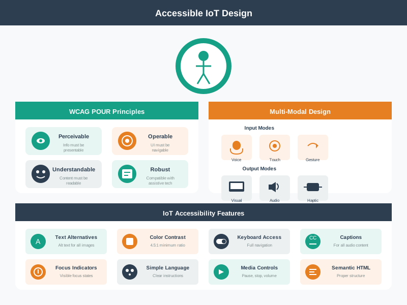
Accessible IoT design combines WCAG principles, multimodal input and output, and concrete implementation features across every device surface.
Start with the critical states: on, off, pending, offline, stale, muted, locked, unlocked, battery low, permission denied, update required, and manual override. Each state needs at least one accessible name, one perceivable signal, one operable control, and one recovery path. If a state matters for safety, access, medication, comfort, or privacy, do not rely on color, sound, animation, voice, or touch alone.
For example, a smart-lock “offline” state should not be a gray icon that only appears in the mobile app. It should have a spoken response, a screen-reader label, visible text, a support-console reason, a physical reader indicator where available, and a recovery path that distinguishes reader offline, phone permission denied, credential revoked, and account role conflict. The same principle applies to a medical dispenser, leak sensor, parking meter, or factory alarm.
Accessible design also covers temporary and situational limits. A user may be wearing gloves, carrying a child, standing in bright sunlight, hearing machinery, using a cracked phone screen, or recovering from an injury. Designing for permanent disability often reveals the same fallback paths that make the product robust in ordinary field conditions.
For assistive technology reviews, start from the task rather than the device. Reading, writing or text entry, navigation, and identification each need a different evidence path. A blind user may need speech output for a thermostat state, a tactile mark on a microwave keypad, Braille or raised labels for a physical control, and a screen-reader action for the same command in the app. A user with low vision may need everyday aids such as eyeglasses, magnification, contrast, and predictable focus order; a user with motor limitations may need switch access, voice, or physical buttons that do not depend on precise touchscreen gestures. Wearable access devices raise the same contract in a more constrained form: gaze trackers, brain-computer interfaces, tongue-based controllers, cheek-switch sensors, and head-mounted displays should name the signal being sensed, the calibration routine, fatigue limits, false-trigger behavior, privacy boundary, and fallback command path. A touchscreen text-entry prototype should also prove whether nonvisual gestures, such as chorded Braille-style input, remain discoverable and recoverable when the glass surface has no tactile landmarks. Stylus text-entry systems such as edge-constrained alphabets ask a different question: can the user learn the gesture set, stay stable in motion, correct errors, and finish text entry without visual confirmation?
Navigation reviews should separate on-screen navigation from physical-world wayfinding. On a phone or tablet, screen readers, multi-touch scan/select gestures, camera-recognized touchscreens, and tangible desktop aids all depend on stable landmarks, feedback after each move, a way to recover from the wrong hierarchy, and gestures that do not collide with the operating system. In the real world, indoor localization helps but is not enough by itself; a blind traveler still needs orientation, route confidence, obstacle or doorway context, stale-position warnings, and a fallback when the map, beacon, camera, or network is wrong. Crowd-assisted approaches such as sidewalk-accessibility inventories can fill gaps that sensors miss, but the review should record who supplied curb-cut, obstacle, surface, and crossing labels, how stale those labels may be, and what the user hears when crowd evidence conflicts with live sensing. Always-on augmented-reality overlays and other head-worn computing aids need the same discipline: prove the field of view, attention cost, battery and heat limits, occlusion risk, and nonvisual fallback before treating the overlay as navigation support. Identification tasks have the same evidence problem. A social-media image caption, alt text, or machine-generated description should name the salient content, disclose uncertainty when confidence is low, avoid unsupported emotion or identity claims, and let the user ask for correction because a plausible but wrong caption can be worse than no caption.
Perceivable: pair color with text, icon shape, sound, vibration, or physical position.
Operable: support keyboard, switch access, screen reader actions, voice, physical controls, and large touch targets where the context needs them.
Consistent: use the same state name across app, device, notification, voice response, dashboard, and support view.
The accessibility requirement is therefore a state contract, not a style preference. A critical control is not complete until every channel that exposes it can name the state, explain delay or failure, offer a safe fallback, and avoid trapping the user in one device, one sense, or one precise gesture.
Uma’s Worst-Moment Test
Moment: standing at a door that will not unlock, phone screen in bright sunlight.
Fails when: “offline” is a gray icon that only appears in the mobile app.
Fix: spoken response, screen-reader label, visible text, and a recovery path naming which failure this is.
32.3 Test Tasks Across Modalities
Write accessibility acceptance criteria around tasks, not widgets. A smart-lock user should be able to check whether the door is locked, understand why unlock failed, recover when the reader is offline, revoke a guest credential, and contact support without depending on one sensory channel or one device. A thermostat user should be able to change the setpoint through touch, physical control, voice, or a screen reader path, and should receive confirmation in a form they can perceive.
Use real assistive technology during review. VoiceOver, TalkBack, NVDA, JAWS, switch control, keyboard-only navigation, browser zoom, reduced-motion settings, high-contrast mode, and speech input expose different failures. Automated tools such as axe-core can catch missing labels and contrast failures, but they will not prove that a blind user understands stale sensor data or that a user with tremor can recover from a mis-tap.
Turn the task into a matrix before testing. Rows should be user goals such as pair device, check status, issue command, cancel command, acknowledge alert, share access, repair permission, and contact support. Columns should be modalities such as screen reader, keyboard, switch control, touch, voice, physical control, haptic feedback, notification, and support console. Mark which combinations must work, which are optional, and which need a documented alternate path.
For IoT products, include failure and latency in the test. A setup flow may pass with VoiceOver when the device is online, then fail when the gateway is offline because the live region never announces “still trying” or “try local reset.” A voice flow may pass in a quiet room, then fail near a compressor because there is no visual or haptic confirmation. A dashboard may pass contrast checks, then fail because stale data is not announced as stale.
Assistive workflows also need a physical-world proof. If a product depends on a tactile overlay, Braille label, or camera-assisted recognition path, test the whole chain: photo capture, perspective correction, button segmentation, label review, generated overlay geometry, attachment, and use on the real appliance. Human-in-the-loop or crowdsourced steps can help with recognition, but the record should name worker availability, turnaround time, privacy boundaries, camera field of view, and whether curved or non-linear controls are unsupported.
Audit the task path: setup, daily control, alert response, sharing, permission repair, support, maintenance, and removal.
Audit the modalities: visual, audio, haptic, touch, keyboard, voice, physical button, notification, and support-agent path.
Audit the fallback: offline use, low battery, failed push notification, denied permission, stale state, and cloud delay.
Evidence should include both user behavior and technical traces. Record the assistive technology version, browser or OS, zoom level, reduced-motion setting, device firmware, event id, command id, and final device state. When a participant gets stuck, note whether the cause was wording, focus order, target size, contrast, missing feedback, delayed sync, unsupported input, or an inaccessible recovery action.
A practical acceptance line can be short: “A keyboard-only user can revoke a guest credential, hear the pending state in an aria-live region, recover from reader offline, and reach support without mouse, color-only cues, or a timeout shorter than the task requires.” That line is easier to test than a generic statement that the app should be accessible.
Uma’s Worst-Moment Test
Moment: pairing a device with VoiceOver while the gateway is offline.
Fails when: the flow only ever passed online — no live region says “still trying” or “try local reset.”
Fix: put failure and latency in the test matrix, and test tasks, not widgets.
32.4 Accessible State on Platforms
Implementation should expose the same control semantics that the visual design implies. Web and app controls need accessible names, roles, values, focus order, error descriptions, and live status updates. Useful handles include semantic HTML buttons, ARIA labels only where native semantics are insufficient, aria-describedby for recovery text, aria-live for asynchronous device state, prefers-reduced-motion, focus restoration after dialogs, and disabled states that still explain why action is unavailable.
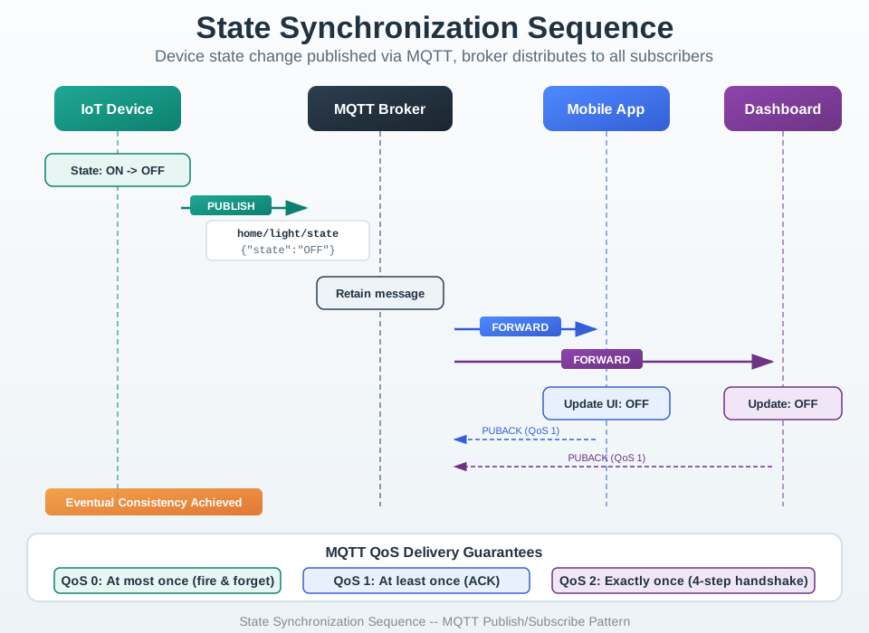
For connected-device state, make accessibility part of the data model. A device shadow, MQTT retained topic, WebSocket event, push notification payload, or local cache should carry state, timestamp freshness, source, confidence, and action availability so each interface can speak or display the same truth. Native layers should map that truth into UIAccessibility on iOS, AccessibilityNodeInfo on Android, notification categories, haptic patterns, and voice-assistant confirmations.
The platform should not force every surface to infer accessibility semantics from a visual string. Publish stable state codes, human-readable labels, severity, freshness, reversibility, next action, and recovery copy from the same source that drives the visual UI. A thermostat event might expose state=heating_pending, freshness=12s, can_cancel=true, and reason=gateway_ack_waiting; the phone, watch, web dashboard, and voice assistant can then present equivalent feedback without inventing different meanings.
Asynchronous state needs special care. If a command can remain pending, fail, retry, or succeed after delay, the UI should announce state changes without stealing focus, keep the control reachable, and avoid disabling the only recovery path. Use polite live regions for progress, assertive alerts only for critical safety changes, visible focus after dialogs, and reduced-motion alternatives for animated status. Physical devices should mirror the same contract with tactile button shape, LED pattern plus label, audio cue plus visual cue, or documented support fallback.
State contract: locked, unlocked, pending, stale, offline, muted, denied, low_battery, update_required, and manual_override should not be visual-only strings.
Input contract: pointer, keyboard, switch, screen reader, voice, hardware button, and automation paths need equivalent command outcomes.
Feedback contract: every critical command needs success, failure, delayed, and reversible feedback across the devices that can issue it.
Test automation should cover the contract but not pretend to replace human review. axe-core, Playwright accessibility snapshots, contrast checks, keyboard tab-order tests, and unit tests for aria-live updates can catch regressions. Manual review with VoiceOver, TalkBack, NVDA, zoom, switch control, high contrast, and reduced motion still catches whether the workflow is understandable, forgiving, and usable under real IoT timing.
The final implementation record should connect accessibility to release engineering: which state codes are exposed, which devices can issue equivalent commands, which fallbacks work offline, which assistive technologies were tested, and which firmware, app, or cloud changes require a fresh accessibility review. That record keeps accessibility from being lost when the product adds a new gateway, account role, notification path, or automation feature.
Checkpoint: Accessible State
You now know:
Critical IoT states such as offline, stale, locked, muted, permission denied, low battery, and manual override need accessible names, signals, controls, and recovery paths.
Reviews should test tasks across modalities: screen reader, keyboard, switch, touch, voice, physical controls, notifications, haptics, and support consoles.
Accessibility belongs in the data model and release record, not only in visual styling.
We have framed accessibility as state exposure. The next question is how WCAG turns that contract into measurable interface requirements.
32.5 Accessibility in IoT
⏱️ ~12 min | ⭐⭐ Intermediate | 📋 P12.C01.U02
Key Concepts
WCAG 2.1: Web Content Accessibility Guidelines specifying minimum contrast ratios, keyboard navigation, and screen reader support.
Screen Reader Compatibility: Design property ensuring all UI elements have accessible names and roles for visually impaired users.
Motor Accessibility: Designing controls with sufficient tap target size (≥44×44 pt) and avoiding fine-motor gestures for users with tremors.
Cognitive Load Reduction: Simplifying interface complexity and using progressive disclosure to support users with cognitive differences.
Multimodal Feedback: Providing information through visual + auditory + haptic channels so users with a single impairment can still receive it.
Alternative Text: Text description of an image that screen readers announce to visually impaired users, required for all informational graphics.
Inclusive Design: Philosophy considering the full spectrum of human diversity from the start rather than retrofitting accessibility later.
IoT Accessibility Checker
Interactive: IoT UX Heuristics Game
WCAG Implementation Basics
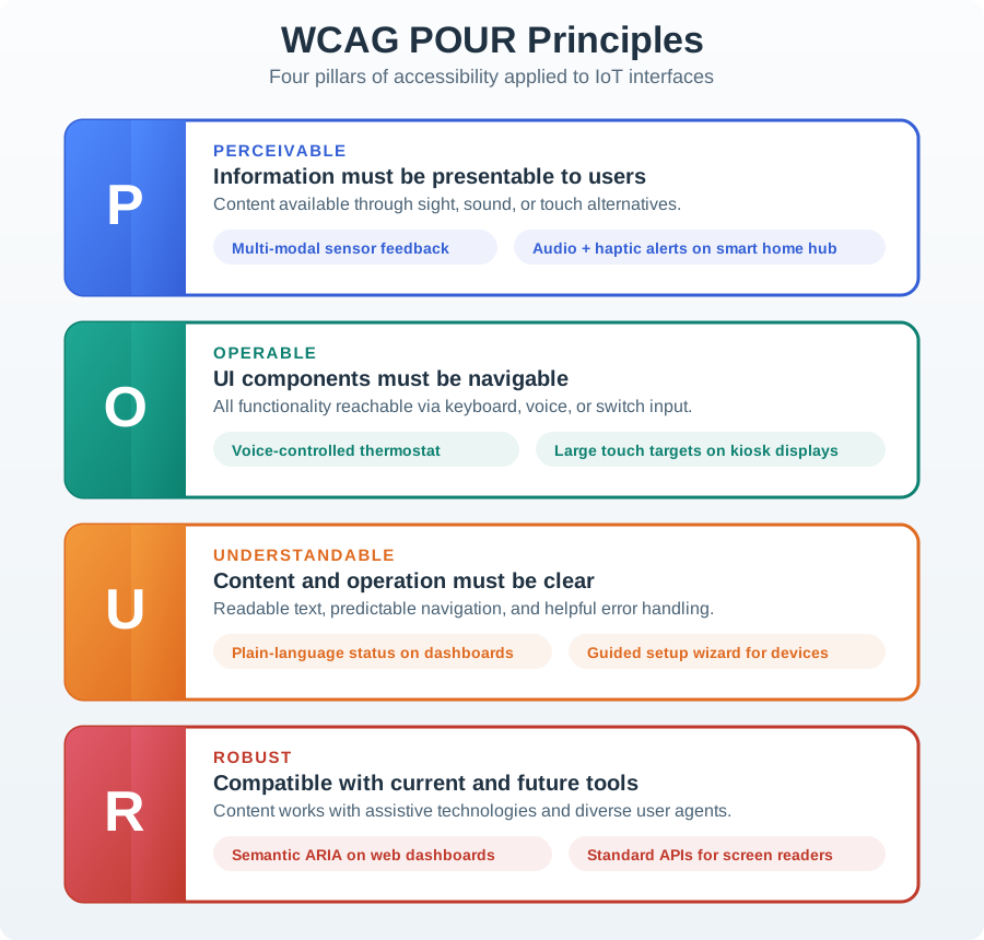
WCAG principles translate into concrete design decisions:
1. Perceivable (Information Available in Multiple Forms)
Visual indicators → Add audio descriptions for screen readers
Color-coded status → Add text labels or icons as redundant cues
Charts/graphs → Provide data tables as alternative
2. Operable (All Functions Accessible)
Touch-only control → Add voice control or physical buttons
Timed actions → Provide “more time” option or remove time limits
Small buttons (28pt) → Enlarge to minimum 44pt targets
3. Understandable (Clear and Predictable)
Technical jargon → Replace with plain language (6th-grade level)
Inconsistent behavior → Make similar actions behave the same way
Cryptic errors → “Sensor disconnected. Check cable.” not “ERR_0x4F3A”
4. Robust (Works with Assistive Tech)
No ARIA labels → Add aria-label="Lock front door" to buttons
Non-semantic HTML → Use <button> not <div class="button">
Missing alt text → Add meaningful fig-alt to all images
Each principle cascades through your design: perceivable affects what users can sense, operable affects what they can do, understandable affects comprehension, and robust ensures compatibility with tools they use.
MVU: WCAG Accessibility Standards
Core Concept: Accessible IoT design follows four WCAG principles - Perceivable, Operable, Understandable, and Robust (POUR) - ensuring devices work for users with visual, auditory, motor, and cognitive differences. Why It Matters: 15-20% of users have some form of disability, and situational impairments (bright sunlight, loud environments, full hands) affect everyone. Accessible design improves usability for all users while meeting legal compliance requirements (ADA, EU Accessibility Act). Key Takeaway: Touch targets must be minimum 44x44 points, text contrast must meet 4.5:1 ratio (WCAG AA), and every critical function must be operable through at least two modalities (visual + audio, touch + voice).
32.5.1 WCAG Principles Applied to IoT
WCAG POUR Principles for IoT Accessibility
Figure 32.1: WCAG POUR Principles for IoT Accessibility
Perceivable: Information must be presentable in multiple ways
Visual indicators + audio alerts
Haptic feedback for touchscreens
High contrast displays
Operable: Interface must be usable by all
Voice control option
Large touch targets (min 44x44pt)
Alternative to time-based interactions
Understandable: Interface behavior must be predictable
Clear, simple language
Consistent behavior
Error messages with solutions
Robust: Compatible with assistive technologies
Screen reader support
Keyboard navigation
API for third-party assistive apps
Example: Multi-Modal Smart Light Control
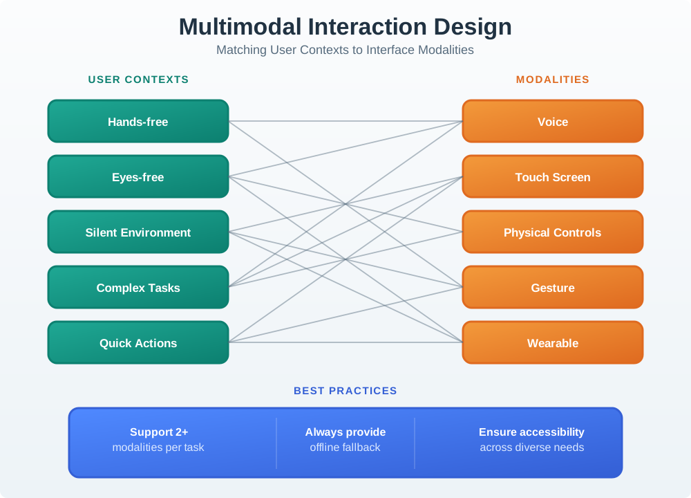
Multi-Modal Interaction Pathways for Accessible IoT
Figure 32.2: Multi-Modal Interaction Pathways for Accessible IoT
An accessible smart light provides multiple ways to interact:
Control Method
Primary Users
Implementation
Voice Commands
Visually impaired, hands-free situations
“Turn on living room light” with audio feedback
Physical Switch
All users, especially when tech fails
Wall switch or device button with tactile feedback
Touchscreen App
Deaf users, silent environments
Large buttons (min 44x44pt), high contrast, clear labels
Automation
Everyone
Motion sensors, schedules, geofencing triggers
Accessibility Features:
Visual Feedback: LED indicator (on/off/dimming state)
Audio Feedback: Text-to-speech confirmation for visually impaired
Haptic Feedback: Vibration on button press (touchscreen)
ARIA Labels: Screen reader support for web/app interfaces
Deep dive: Putting Numbers to It
WCAG contrast ratio calculation: For text to be WCAG AA compliant, contrast ratio \(C = \frac{L_1 + 0.05}{L_2 + 0.05}\) must be \(\geq 4.5\) (normal text) or \(\geq 3.0\) (large text ≥18pt). Light gray #AAAAAA on white #FFFFFF has relative luminance \(L_{gray} = 0.402\), \(L_{white} = 1.0\), giving \(C = \frac{1.0 + 0.05}{0.402 + 0.05} \approx 2.32\) — fails WCAG AA (needs 4.5). Dark gray #595959 has \(L = 0.0999\), giving \(C = \frac{1.0 + 0.05}{0.0999 + 0.05} \approx 7.0\) — passes WCAG AA.
Show code
viewof buttonSize = Inputs.range([24,72], {value:44,step:2,label:"Button size (pt):"})viewof buttonDistance = Inputs.range([50,400], {value:200,step:10,label:"Distance to button (pt):"})fittsTime = {const a =50;// Intercept (ms)const b =150;// Slope (ms)const D = buttonDistance;const W = buttonSize;return a + b *Math.log2((D / W) +1);}md`**Fitts's Law Calculator****Current Configuration:**- Button size: **${buttonSize} × ${buttonSize} pt**- Distance: **${buttonDistance} pt**- Targeting time: **${fittsTime.toFixed(0)} ms****WCAG Compliance:** ${buttonSize >=44?'✅ Passes (≥44pt)':'❌ Fails (needs ≥44pt)'}*Larger buttons and shorter distances make targeting faster and easier for users with motor impairments.*`
Touch target accessibility: WCAG 2.5.5 requires minimum \(44 \times 44 \text{pt}\) touch targets. A 32pt button has area \(A = 32^2 = 1{,}024 \text{ pt}^2\). A 44pt button has \(A = 44^2 = 1{,}936 \text{ pt}^2\) — 89% larger. For elderly users with tremor (targeting error \(\sigma \approx 8\text{-}12\text{pt}\)), the success rate follows \(P_{hit} \approx \text{erf}\left(\frac{r}{\sqrt{2}\sigma}\right)\) where \(r\) is button radius. For 32pt (\(r = 16\text{pt}\)) with \(\sigma = 10\text{pt}\): \(P_{hit} \approx 0.75\) (75% success). For 44pt (\(r = 22\text{pt}\)): \(P_{hit} \approx 0.89\) (89% success) — a 19% improvement.
Fitts’s Law for motor accessibility: Time to reach a target is \(T = a + b \log_2\left(\frac{D}{W} + 1\right)\) where \(D\) = distance, \(W\) = target width, \(a \approx 50\text{ms}\), \(b \approx 150\text{ms}\). For a button 200pt away, 32pt wide: \(T = 50 + 150 \log_2\left(\frac{200}{32} + 1\right) \approx 50 + 150 \times 2.86 \approx 479 \text{ ms}\). For 48pt wide: \(T \approx 50 + 150 \times 2.37 \approx 405 \text{ ms}\) — 15% faster targeting, critical for users with motor impairments.
Multi-device state sync latency: For a smart home with \(N = 5\) devices (phone, tablet, watch, hub, voice assistant), achieving consistent state across all devices with \(\tau_{sync} < 500\text{ms}\) (perception threshold) requires real-time pub-sub architecture. Star topology (all devices → hub → cloud → broadcast) has 2-hop latency \(\tau = 2 \times (L_{device-cloud} + L_{cloud-device}) \approx 2 \times (150\text{ms}) = 300\text{ms}\). Peer-to-peer mesh has \(N-1 = 4\) simultaneous broadcasts at \(\tau \approx 20\text{-}50\text{ms}\) (local network) — 6× faster than cloud round-trip.
Screen reader semantic markup efficiency: Proper ARIA labels reduce navigation time for blind users. A 20-button interface without ARIA forces linear scanning: \(T_{find} = \frac{N}{2} \times t_{swipe} = \frac{20}{2} \times 1.5\text{s} = 15\text{s}\) average to find a specific button. With semantic <nav>, <section>, role="button" markup, screen readers enable landmark jumping: \(T_{find} \approx 2 \times 1.5\text{s} = 3\text{s}\) (2 jumps) — an 80% reduction in navigation time.
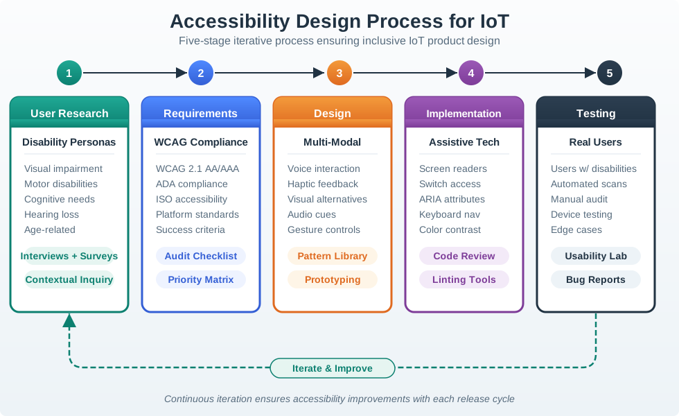
32.5.2 Accessibility Design Process
The following diagram illustrates a systematic approach to designing accessible IoT interfaces. This process ensures accessibility is built-in from the start rather than retrofitted.
Accessibility Design Process for IoT Products
Figure 32.3: Accessibility Design Process for IoT Products
Key Process Steps:
User Research: Understand the full range of users, including those with permanent, temporary, and situational disabilities
Requirements: Define accessibility standards (WCAG AA minimum) and legal compliance needs
Accessible Design: Apply universal design principles with measurable criteria
Implementation: Build with semantic markup, keyboard support, and assistive technology APIs
Testing: Combine automated tools (25-30% coverage) with real user testing (catches remaining 70-75%)
Tradeoff: Simplicity vs Customization
Option A: Offer a simple, opinionated design with sensible defaults that work for most users, minimizing configuration options and decision fatigue. Option B: Provide extensive customization options allowing users to tailor every aspect of the experience to their specific preferences and workflows. Decision Factors: Choose simplicity when users are diverse (varying tech skills, ages, contexts), when quick setup matters, or when the product should “just work.” Choose customization when users have strong individual preferences, when workflows vary significantly between users, or when the product serves professionals who need precise control. Consider a hybrid approach: simple defaults that work immediately, with customization accessible through settings for those who want it.
Universal vs Targeted Access
Option A: Design for universal accessibility from the start, ensuring the core experience works for users across all ability levels (vision, hearing, motor, cognitive), even if this constrains some design choices. Option B: Design the primary experience for the mainstream user, then add accessibility features as accommodations for specific disability groups. Decision Factors: Choose universal design when building consumer products with broad market reach, when regulatory compliance (ADA, WCAG) is required, or when you want features that benefit everyone (large buttons help all users, not just those with motor impairments). Choose targeted accessibility when serving a well-defined user group, when adding universal features would significantly increase cost or complexity, or when the product inherently requires specific abilities (a running app assumes mobility). Note: Universal design often creates better products for everyone, and retrofit accessibility is typically more expensive than designing inclusively from the start.
Keyboard Navigation: Tab through controls without mouse
High Contrast: 4.5:1 minimum contrast ratio (WCAG AA)
Fallback Controls: Always works without internet/app
Checkpoint: WCAG Mechanics
You now know:
WCAG POUR maps to IoT design as perceivable signals, operable controls, understandable errors, and robust assistive-technology support.
The chapter’s minimum numbers are concrete: 44x44 pt touch targets, 4.5:1 normal-text contrast, 3.0 large-text contrast, and at least two modalities for critical functions.
Automated checks cover only part of the process, so the design process still needs real users and real assistive technology.
Those mechanics are easiest to remember when they are tested as scenarios, so the next checks put WCAG choices into smart-home and hub decisions.
Concept Relationships
Accessibility enables multi-device experiences: Designing for disabilities creates features everyone uses across different devices: - Large touch targets (for arthritis) → work better on all devices, especially wearables - Voice control (for vision impairment) → convenient for hands-free situations (driving, cooking) - High contrast (for low vision) → readable in bright sunlight on mobile screens
Universal design reduces platform fragmentation: One accessible interface often works across phone/tablet/desktop without device-specific versions.
Related concepts:
Progressive disclosure (UX Fundamentals) → show essential features first, advanced options later
Offline-first design (UX Introduction) → core functions work without connectivity
We have established the accessibility rules for one interface. Multi-device IoT adds a second constraint: the same state must stay understandable when it moves from a thermostat face to a phone, watch, dashboard, or voice response.
32.6 Multi-Device Experiences
⏱️ ~10 min | ⭐⭐ Intermediate | 📋 P12.C01.U03
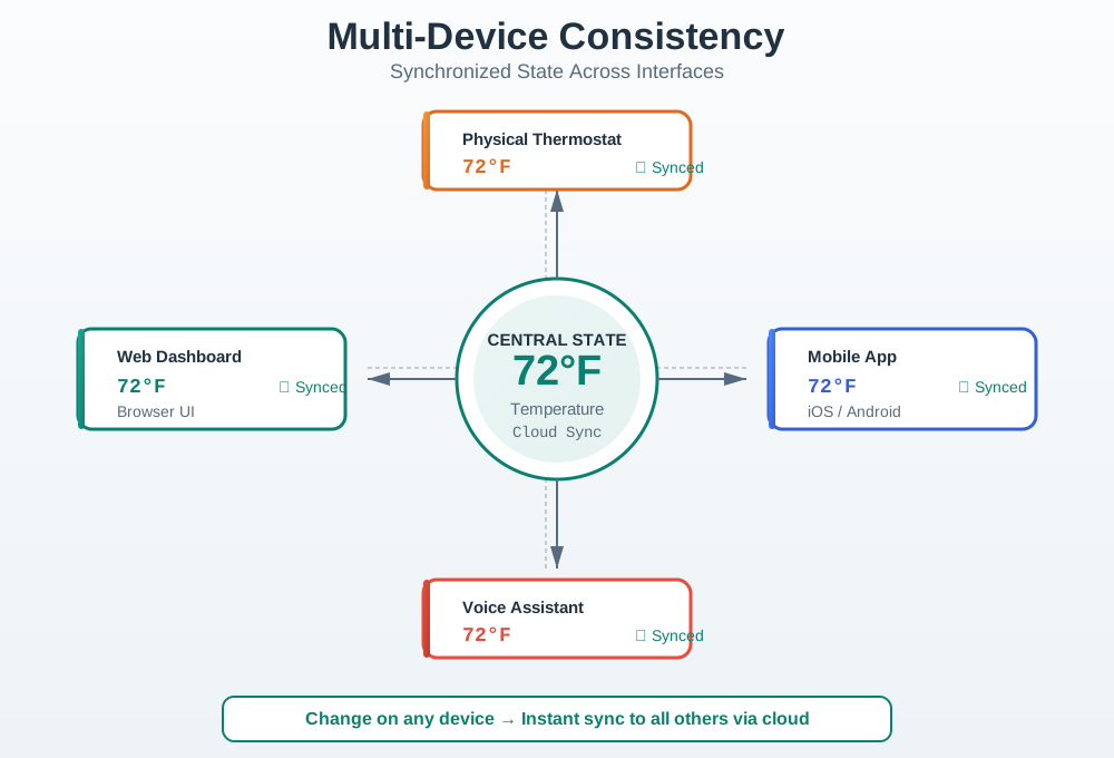
32.6.1 Consistency Across Devices
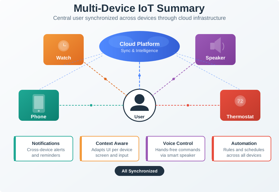
Figure 32.4: Multi-Device State Synchronization and Consistent Terminology
Figure 32.5: State Synchronization Sequence: Timeline showing how a change made on the physical device propagates through the cloud to update all other interfaces within seconds
Design Principles:
Same core functionality across all interfaces
Interface-appropriate interactions (touch vs voice vs physical)
Consistent terminology and iconography
Synchronized state across devices
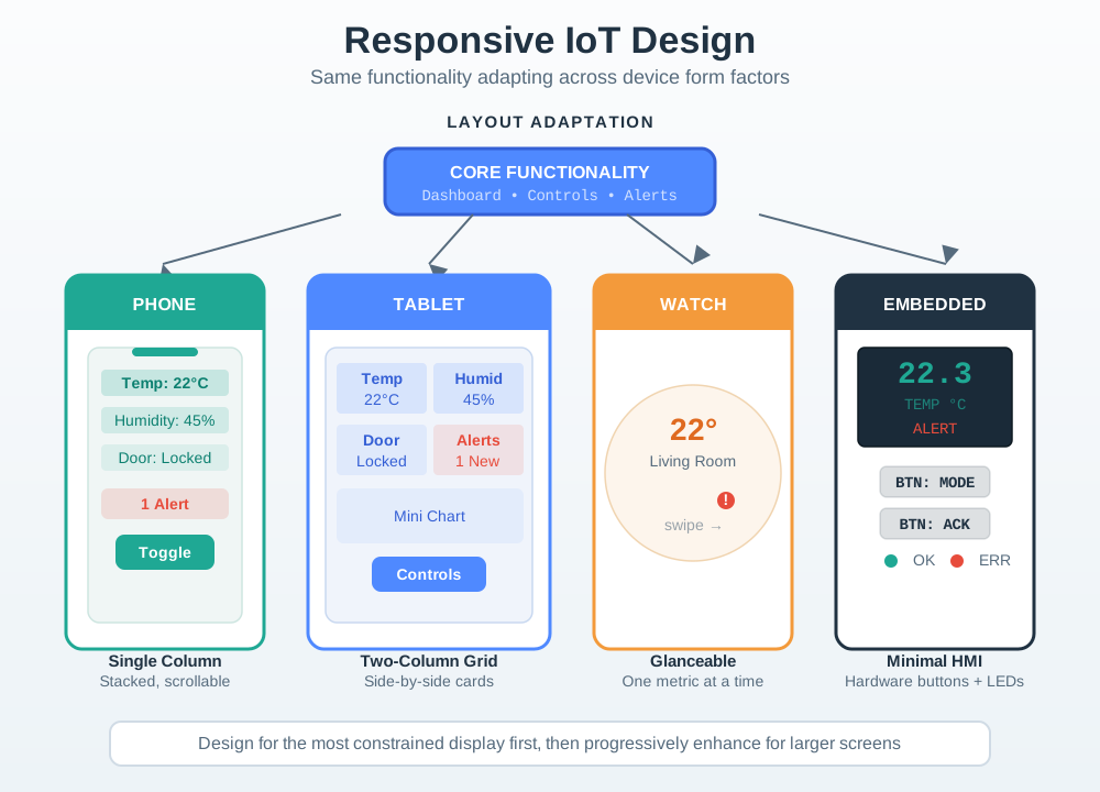
32.6.2 Responsive Design Patterns for IoT
Different devices require different interface approaches while maintaining consistent functionality:
Responsive Design Patterns Across IoT Device Types
Figure 32.6: Responsive Design Patterns Across IoT Device Types
Device Type
Primary Use
Interface Approach
Touch Target
Smartwatch
Quick glances, simple actions
Minimal UI, swipe gestures
48x48pt+
Smartphone
On-the-go control, notifications
Touch-optimized, one-hand use
44x44pt
Tablet
Room-by-room control, dashboards
Multi-touch, landscape layouts
44x44pt
Desktop
Configuration, analytics
Mouse/keyboard precision
24x24pt+
Voice
Hands-free, ambient control
Natural language, confirmations
N/A
Checkpoint: Multi-Device Fit
You now know:
Consistency means shared terminology, icon meaning, permissions, and synchronized state, not identical screens on every device.
Form factor changes the interface: watches need glanceable quick actions, tablets can show room grids, web dashboards can handle analytics, and voice should stay short and confirm ambiguous commands.
The chapter’s sync target is practical: state changes should reach other devices within 2 seconds, and sub-500 ms feedback often needs pub-sub or local paths.
The next quizzes test that distinction: keep the mental model consistent while giving each surface a job it can actually perform.
Common Pitfalls
Avoid Retrofit Accessibility
Attempting to add screen reader support and colour contrast after the UI is built requires extensive refactoring because accessibility is architectural, not cosmetic. The retrofit approach takes 3-5× longer than building it in from the start. Include accessibility acceptance criteria in every user story and test with assistive technology in each sprint.
Colour-Only Status Fails
A status LED that glows red for error and green for OK is completely inaccessible to the 8% of men with colour vision deficiency. Always pair colour with a secondary cue—icon shape, text label, pattern, or sound—so status is perceivable through at least two independent channels.
44x44 Touch Target Minimums
Small controls designed to look elegant on a mouse-operated prototype become impossible to tap accurately for users with tremors, arthritis, or large fingers. Enforce a minimum 44×44 pt touch target for all interactive elements in the design system and verify with a fist-sized tap test during usability testing.
Label the Diagram
💻 Code Challenge
Checkpoint: Pitfalls and Practice
You now know:
Retrofit accessibility can take 3-5x longer than building acceptance criteria into each story.
Color-only status fails users with color-vision differences, so every critical cue needs text, shape, pattern, sound, or another redundant channel.
Label, code, matching, and ordering activities reinforce the same rule: accessibility is a tested behavior, not a decorative layer.
With the core rules tested, the summary turns the chapter into release-ready checklists and two optional deep-dive case studies.
32.7 Summary
This chapter covered accessibility and multi-device UX design for IoT systems. Here are the key takeaways:
32.7.1 Key Accessibility Standards
Standard
Requirement
IoT Application
WCAG 2.1 AA
Minimum compliance level
4.5:1 contrast, 44pt targets
ADA/Section 508
US legal requirement
Public-facing IoT must comply
EU Accessibility Act
European requirement
IoT products sold in EU
POUR Principles:
Perceivable: Information in multiple formats (visual + audio + haptic)
Operable: Usable via multiple inputs (touch + voice + keyboard)
Remember: Accessibility is not optional - it’s legally required (ADA, Section 508, EU Accessibility Act) and improves UX for ALL users, not just those with disabilities.
Deep dive: Accessible Medication Dispensers
Scenario: A smart medication dispenser for elderly users (target: 65-85 years old) launched with 67% customer return rate due to accessibility failures.
Original Design (Inaccessible): - 3.5-inch touchscreen with 12pt font - 6 icon buttons (no text labels) - Setup via smartphone app only (no alternative) - Audio alerts at 65 dB (barely audible) - Glossy black enclosure (high glare, fingerprints)
Accessibility Audit Results:
WCAG Principle
Violations
Impact
Severity
Perceivable
8 violations
85% of users can’t read screen
Critical
Operable
5 violations
70% can’t press buttons accurately
Critical
Understandable
3 violations
60% confused by icons
Major
Robust
2 violations
Screen readers don’t work
Major
Detailed Accessibility Failures:
WCAG 1.4.3: Contrast (Minimum) - FAIL - Text: Light gray (#CCCCCC) on white background - Contrast ratio: 1.6:1 (needs 4.5:1 for WCAG AA) - Impact: 85% of elderly users can’t read text - Cost: 12-minute average support calls for “can’t see instructions”
WCAG 1.4.1: Use of Color - FAIL - Medication slot colors: Red/green indicators (color-blind unfriendly) - No redundant cue (shape, text, icon) - Impact: 8% of users (color-blind) can’t distinguish slots
WCAG 1.4.2: Audio Control - FAIL - Reminder alarm: 65 dB (hard to hear for hearing-impaired) - No visual flash indicator - No adjustable volume - Impact: 45% of users miss medication reminders
Uma’s Worst-Moment Test
Moment: pill time for an 85-year-old, and the reminder goes unheard.
Fails when: the alert is one 65 dB tone — 45% of users missed doses.
Fix: the redesign’s multi-sensory alert — 85 dB audio plus LED flash — with 56pt buttons to confirm.
Redesign Based on WCAG Compliance:
1. Perceivable (Visual Improvements)
Element
Before
After
WCAG Compliance
Font Size
12pt
18pt (body), 24pt (headings)
✓ WCAG AAA (large text)
Contrast
1.6:1 (gray on white)
21:1 (black on white)
✓ WCAG AAA (7:1 required)
Color Coding
Red/green only
Red/green PLUS shapes (circle/triangle) PLUS text (“Morning”/“Evening”)
✓ WCAG 1.4.1 (not relying on color alone)
Screen Glare
Glossy black enclosure
Matte white enclosure + anti-glare screen coating
✓ Reduces reflections by 80%
Visual Alerts
Audio only (65 dB)
Audio (85 dB) + bright LED flash (red for missed dose, green for taken)
✓ Multi-sensory redundancy
2. Operable (Interaction Improvements)
Element
Before
After
WCAG Compliance
Touch Targets
32×32pt buttons
56×56pt buttons (26% larger than 44pt minimum)
✓ WCAG 2.5.5
Button Spacing
2pt gaps
12pt gaps (prevents accidental adjacent taps)
✓ WCAG 2.5.8 (spacing)
Physical Buttons
Touchscreen only
Touchscreen + 3 large physical buttons (Confirm, Cancel, Help)
✓ Alternative to touchscreen
Button Labels
Icons only
Icons + text labels (“Take Medicine” not just pill icon)
✓ WCAG 2.4.6 (descriptive)
Voice Control
None
“OK Dispenser, did I take my morning pills?”
✓ Hands-free operation
3. Understandable (Cognitive Improvements)
Element
Before
After
WCAG Compliance
Setup
15-step smartphone app
3-step guided setup on device (“What time do you take pills?” → “Morning 8am” → Done)
✓ Simplified workflow
Error Messages
“ERR_SYNC_FAIL” (cryptic)
“Can’t connect to internet. Medicine schedule still works. [Try Again] [Skip]”
Before (Inaccessible Design): - Customer return rate: 67% within 30 days - Reason: “Too hard to use,” “Can’t see screen,” “Buttons too small” - Support calls: 22 min average (walking users through setup) - Cost per unit: $50 refund + $18 support + $12 restocking = $80 - On 10,000 units: 6,700 returns × $80 = $536,000 loss
After (Accessible Design): - Customer return rate: 11% (normal for electronics) - Support calls: 4 min average (simple questions) - Additional design cost: $35K (accessibility audit + redesign + testing) - Improved retention: 89% of users still using device after 1 year (vs. 33% before) - Cost avoided: $501K ($536K - $35K redesign cost)
Key Accessibility Features That Benefited ALL Users (Not Just Disabled):
Feature
Designed For
Also Helps
Large 18pt font
Vision-impaired elderly
Everyone reading from 6+ feet away, bright sunlight glare
High contrast (21:1)
Low vision
Everyone in poor lighting, older adults (need 3× more contrast)
56pt touch targets
Arthritis, tremor
Everyone with wet/dirty hands, gloves, rushing
Voice control
Blind users, dexterity impairments
Everyone with hands full (carrying groceries), multitasking
Physical buttons
Screen reader users
Everyone when touchscreen fails, gloves on, or battery-saving mode
Key Insight: Designing for accessibility (large text, high contrast, large buttons, voice control, multi-sensory alerts) solved problems for elderly users AND improved experience for ALL users. Accessibility isn’t a niche concern—it’s universal design that makes products more usable in diverse contexts (gloves, glare, noise, distraction). The $35K accessibility investment saved $448K in returns and created a product 89% of users still use after 1 year (vs. 33% before).
Checkpoint: Accessibility ROI
You now know:
The medication-dispenser example links accessibility failures to business outcomes: 67% returns before redesign, 11% after redesign, and $448K savings from a $35K investment.
Large text, high contrast, 56pt targets, physical buttons, voice control, and multi-sensory alerts helped elderly users and improved ordinary use under glare, noise, gloves, and distraction.
ROI evidence is strongest when it combines WCAG findings, task success, error rate, support cost, and retention.
Deep dive: Multi-Device UX Consistency
When designing IoT systems that span multiple devices (smartphone, tablet, smartwatch, web, voice assistant, physical device), you face a critical trade-off: consistency (same experience everywhere) vs. platform-appropriate design (optimize for each device’s strengths).
The Consistency vs. Appropriateness Spectrum:
Approach
Philosophy
Example
Pros
Cons
Extreme Consistency
Identical UI on all platforms
Responsive web app that looks same on phone/tablet/desktop
Easy to learn, predictable
Ignores platform strengths, poor UX on some devices
Thermostat set to 72°F on phone → web/watch/physical device all show 72°F within 2 sec
Permissions
Security model consistent
“Guest mode” works same way on all interfaces
What to Make Platform-Appropriate:
Platform
Strengths
Interface Strategy
Example
Smartphone
Glanceable, mobile, notifications
Quick controls, status overview, alerts
Smart lock: “Lock/Unlock” + “Who’s home?”
Tablet
Large screen, relaxed use
Detailed dashboards, multi-room control, graphs
Smart home: Room-by-room control grid
Smartwatch
Ultra-glanceable, wrist-convenient
Minimal info, 1-tap actions, complications
Smart lock: “Lock” button + “Front door unlocked” glance
Desktop/Web
Keyboard+mouse, large screen, analytical
Configuration, analytics, troubleshooting, detailed history
Smart thermostat: Energy charts, 7-day schedule editor
Voice Assistant
Hands-free, ambient
Simple commands, status queries, no complex navigation
“Alexa, lock front door” OR “What’s the temperature?”
Physical Device
Always available, tactile, offline
Core functions without app, physical feedback
Smart thermostat: Dial to adjust temp, works if internet down
Multi-Device Task Flow Example: Smart Lock
Scenario: User wants to let dog walker in at 2pm today.
Device
Interface Design
Rationale
Smartphone (Primary)
Full feature set: Create temporary access code → Set time window (2-3pm today) → Name “Dog Walker” → [Save]
Most capable interface, full keyboard, can handle complexity
Tablet
Same as smartphone, optimized layout
Large screen → no simplification needed
Smartwatch
“Quick Commands”: Tap “Dog Walker” preset (created on phone) → Auto-enables 2-3pm today
Minimal UI for pre-configured actions only
Web
Same as smartphone + bulk management (create codes for multiple users at once)
Desktop power users get batch operations
Voice
“Alexa, enable dog walker access code until 3pm”
Natural language, no visual UI needed
Physical Lock
Keypad: Enter “5423” (dog walker’s code) → LED blinks green → unlocks
Works offline, no app required
Key Principle: Create complex config on capable devices (phone/web), execute simple commands on any device (watch/voice/physical).
State Synchronization Rules:
State Change
Where It Happens
Sync Requirement
Example
User action
Any device
Sync to all devices within 2 sec
User locks door on phone → watch shows “Locked” within 2 sec
Automated action
System (schedule, sensor)
Notify all devices
Motion detected → push notification to phone + smartwatch
Conflict resolution
Latest action wins
Most recent command
User unlocks on phone at 14:32:05, system auto-locks at 14:32:03 → unlocked (phone wins)
Decision Matrix: Which Features on Which Devices?
Feature
Phone
Tablet
Watch
Web
Voice
Physical
Reasoning
View status
✅
✅
✅
✅
✅
✅
Universal need
Quick control
✅
✅
✅
❌
✅
✅
Web for detailed config, not quick actions
Detailed config
✅
✅
❌
✅
❌
❌
Watch/voice/physical too limited
Analytics/history
Simplified
✅ Full
❌
✅ Full
❌
❌
Large screen needed for graphs
Notifications
✅
✅
✅
✅
❌
✅ (LED)
Voice doesn’t push notifications
Guest access
✅
✅
❌
✅
❌
✅
Watch too small for user management
Common Mistakes:
❌ Mistake 1: Forcing Phone UX onto Smartwatch
Problem: Scrolling through 50-item device list on 1.5-inch watch screen
Fix: Watch shows only current room’s devices + favorites (context-aware)
❌ Mistake 2: Making Voice Assistant Do Everything
Problem: “Alexa, create a schedule for bedroom lights to turn on at 6:30am on weekdays, 8am on weekends, with 30-minute gradual brightening, but only if motion detected”
Fix: Voice for simple commands (“Turn on bedroom lights”), phone/web for complex config
❌ Mistake 3: Inconsistent Terminology
Problem: “Away Mode” (phone) vs. “Vacation Setting” (web) vs. “Unoccupied” (voice)
Fix: Pick ONE term (“Away Mode”) and use everywhere
❌ Mistake 4: Platform Feature Parity
Problem: Cramming analytics dashboard into smartwatch (unreadable)
Fix: Each platform gets features appropriate to its context and constraints
Testing Multi-Device UX:
Cross-Device Task Flow Test:
User creates schedule on phone → Verify: Appears on tablet, web within 2 sec
User edits schedule on web → Verify: Phone shows update
User triggers scene via voice → Verify: Phone/tablet/watch show new state
System auto-adjusts (motion sensor) → Verify: All devices receive notification
Handoff Testing:
User starts task on phone (searching for device in list)
User continues on tablet (larger screen easier for browsing)
Key Insight: Consistency in terminology and data (state sync) enables users to switch devices seamlessly. But interface design should leverage each platform’s strengths—cramming a desktop interface onto a smartwatch creates terrible UX. Design hierarchy: Smartphone = full-featured primary, Watch = glanceable quick actions, Web = detailed analytics, Voice = hands-free simple commands, Physical = works offline.
Deep dive: Beyond Automated Accessibility Tests
The Mistake: Running automated WCAG checkers (WAVE, axe, Lighthouse) and assuming 100% pass rate means the product is accessible to disabled users.
Why It Fails:
Automated accessibility tools catch only 25-30% of actual accessibility issues. They find technical violations (missing alt text, contrast ratios) but miss real-world usability problems for disabled users.
Example: Smart Home App Accessibility Audit
Automated Tool Results (WAVE): - ✅ All images have alt text - ✅ Color contrast meets 4.5:1 ratio - ✅ Form inputs have labels - ✅ Heading hierarchy correct - Result: 100% WCAG AA Compliant (according to automated checker)
Real User Testing with Disabled Users (8 participants):
Blind User (Screen Reader):
Issue: Alt text exists but says “image_2847.png” (useless)
Impact: User has no idea what icon represents (settings? help? close?)
Automated Tool: Passed (alt text present, didn’t check quality)
Low Vision User (Screen Magnification 400%):
Issue: Buttons move outside viewport when zoomed, no way to scroll
Impact: Can’t access 60% of interface at 400% zoom
Automated Tool: Passed (contrast correct, didn’t test zoomed behavior)
Motor Impairment User (Head Pointer):
Issue: Buttons are 44pt (WCAG minimum) but spaced 2pt apart
Impact: Accidentally activates adjacent buttons 70% of time
2 motor impairment users (head pointer, switch device, or voice control)
2 deaf or cognitive impairment users
Test Tasks (Not Just Navigation): - ❌ “Can you navigate to the settings page?” (too easy) - ✅ “You want lights to turn off every night at 10pm. Set that up.” (real task)
Observe:
Task success rate (did they complete it?)
Time on task (2× longer than sighted users = problem)
Error rate (wrong taps, backtracking)
Frustration indicators (sighs, “I give up”)
Workarounds (memorizing button positions because labels unhelpful)
Example Findings:
Before Real User Testing (Automated Tools Only): - Automated score: 100% WCAG AA - Assumed: Product is accessible - Launch: 58% return rate from disabled users (“too hard to use”)
After Real User Testing:
Found: 18 critical issues automated tools missed
Fixed: Alt text quality, zoom behavior, spacing, caption accuracy, cognitive load
Accessible IoT design ensures devices and interfaces work for users with visual, motor, cognitive, or hearing differences, expanding market reach while meeting legal obligations in many jurisdictions.
Key Insight: Automated tools are necessary (cheap, fast, catch technical issues) but NOT sufficient (miss 70-75% of real accessibility barriers). Real user testing with disabled people reveals what automated tools can’t: meaningful alt text, zoom behavior, cognitive load, real-world assistive tech compatibility. Spending $6K on real user testing prevents $280K+ in post-launch accessibility failures.
Checkpoint: Testing Stack
You now know:
Automated tools are fast regression gates but catch only 25-30% of real accessibility issues.
Manual expert review can catch 60-70%, while real user testing with disabled participants can catch 95%+ of barriers.
A release record should name tools, assistive technologies, user tasks, device states, firmware/app versions, and the evidence that blocked or delayed states remain recoverable.