2 Foundations of IoT User Experience
IoT UX fundamentals, connected product usability, IoT state feedback, IoT interaction design, UX recovery design
2.1 Start Simple
Before drawing an app screen, picture one person trying to make a connected product do something useful in a real place. This chapter starts from that whole experience: what the person wants, what the device knows, what the system says back, and how the person recovers when sensing, automation, permission, or support does not behave as expected.
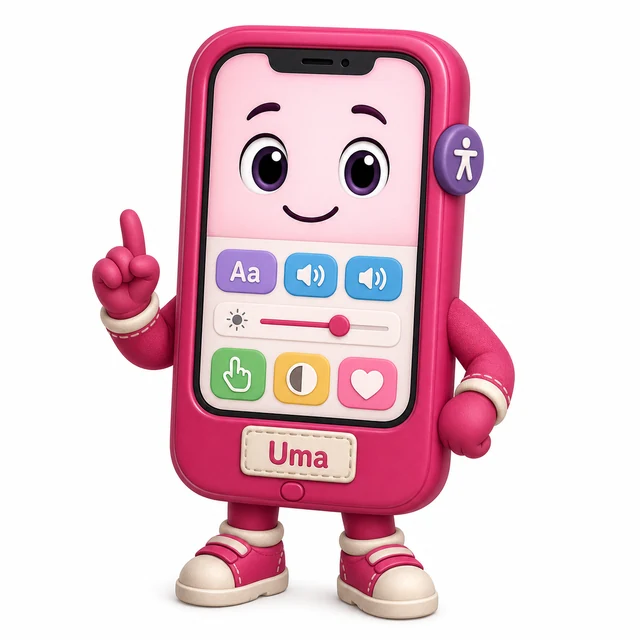
UX Uma
“If a tired person at 2am can’t use it, the feature doesn’t exist yet — design for the worst moment, not the demo.”
Through this chapter, Uma asks each fundamental one question: whose worst moment is this, and does the design survive it?
2.2 In 60 Seconds
UX design is the quality of the whole experience a person has with a product or service. In IoT, that experience is spread across devices, apps, dashboards, alerts, automation, physical controls, permissions, maintenance, and support.
Good IoT UX is not simply a clean screen. It helps people:
- understand what the system is doing
- know whether information is current or stale
- control or override automation when needed
- recover when a device, network, permission, or battery state changes
- use the product across roles, places, abilities, and touchpoints
- trust the system without needing hidden technical knowledge
This chapter introduces the fundamentals that later UX chapters use for evaluation, examples, pitfalls, patterns, interface design, and prototyping.
2.3 Overview: UX Covers Every Touchpoint
For a connected product, UX is the way a person understands and controls the whole system, not just the application screen. A useful first pass asks whether the device, app, dashboard, alert, automation, support path, and maintenance record tell the same story. If the wall device says one thing, the app says another, and support sees a third state, the experience fails even if every individual screen looks polished.
The simplest review starts with a real goal. A meeting owner does not want to “use a thermostat app”; they want the room comfortable for a specific meeting without breaking the normal schedule for the next group. A resident does not want to “open an access screen”; they want a guest to enter safely and then lose access at the right time. UX turns those goals into visible state, safe control, clear recovery, and consistent language.

- State: Can the user tell whether information is current, stale, offline, pending, denied, overridden, or failed?
- Control: Can the user pause, override, undo, restore, or choose a fallback when the system affects them?
- Recovery: Does the design explain what to do when setup, connectivity, power, permission, or automation changes?
If those three checks are weak, visual polish will not rescue the experience. The product will feel unpredictable as soon as real-world conditions change. If those checks are strong, the product can stay understandable across roles, places, abilities, devices, and support handoffs. The same rule applies to a school lab kit, a smart-lock service, a wearable health sensor, or a factory alert panel: the user should never have to guess which surface is authoritative, whether the latest reading arrived, or who owns the next action. ## Connected-Product Flow Review {.depth-l1}
Use a compact connected-experience review before accepting an IoT UX decision. For each user goal, record the role, physical context, touchpoints, system states, control pattern, accessibility constraint, privacy boundary, validation method, and condition that would make the decision stale. This should be short enough to maintain, but specific enough that a designer, firmware engineer, support agent, and product owner can see the same promise.
Example: for a thermostat meeting override, the review should show who can change the room, where the control appears, whether the schedule is paused or replaced, how long the override lasts, what the wall device and app display, and how the normal schedule resumes. It should also state what happens when the wall device is offline, the app command is delayed, the occupancy sensor disagrees, or another role changes the schedule.
- Reject screen-only evidence. A mockup that ignores the device indicator, stale sensor data, offline mode, and support view is incomplete.
- Reject happy-path-only evidence. Include a low-battery device, a delayed command, a denied permission, or a shared-control conflict.
- Accept bounded evidence. A decision is reviewable when it states what was tested, what remains unknown, who owns it, and what condition would reopen the decision.
Use prototypes that match the decision. Paper or Figma can test wording, hierarchy, and sequence. A bench ESP32, nRF52, Raspberry Pi, or Arduino prototype can test local indicators, button affordances, haptic cues, and basic sensing. MQTT, Node-RED, Home Assistant, Grafana, a device-shadow stub, or a support-board mock can test stale data, handoff language, and dashboard responsibility without pretending the full production stack is finished.
Finish the review by writing one sentence that limits the claim: what was observed, which roles were missing, which failure states were not tested, and what event would reopen the UX decision. That sentence keeps later teams from treating a narrow usability session, a clean app demo, or a lab-only device test as proof that the connected service works in the field. ## Why IoT UX Fails Differently {.depth-l2}
IoT UX failures often come from distributed state. The person sees one surface, but the real system spans firmware, radio links, gateways, cloud jobs, permissions, automation rules, and support tooling. Each layer can be correct locally while the total experience is confusing. An app may accept a command, a cloud queue may delay it, a device may be asleep to save power, and a sensor may report an older value, all while the user expects one clear answer.
- Latency creates uncertainty. A command may be tapped, queued, sent, applied, rejected, or timed out; the interface needs separate language for each state.
- Authority can be split. A local button, mobile app, schedule, occupancy rule, and admin dashboard may all try to control the same device.
- Evidence ages. A dashboard value without freshness, source, or confidence can look trustworthy after the sensor or link has failed.
- Consent has a physical boundary. Sensors may affect bystanders, guests, maintainers, and shared-space users who never opened the app.
The deeper design task is to keep those distributed states legible so people can make safe decisions without understanding every implementation layer. BLE pairing state, Matter commissioning state, MQTT acknowledgement, retained telemetry, device-shadow freshness, firmware update state, battery saver mode, and support ownership are implementation details; UX turns the details that matter into words such as pending, last seen, denied, manual mode, unsafe, support owns next step, or restore normal schedule.
This is why UX belongs early in IoT system design. Once telemetry topics, permission models, local fallback, and support records are already fixed, the interface may have no reliable way to explain the truth. Early UX review asks what state must be exposed, where the source of truth lives, how long evidence remains fresh, who can override whom, and how the user recovers when surfaces disagree.
2.4 Learning Objectives
By the end of this chapter, you will be able to:
- describe UX as the whole connected experience, not just an app interface
- explain why IoT UX depends on context, state, recovery, and support
- identify the core fundamentals of usable connected products
- recognize when automation needs explanation, control, or fallback
- apply UX fundamentals to a simple IoT scenario
- prepare a design for later evaluation and testing
2.5 UX Is The Whole Connected Experience
Traditional app UX often focuses on screens, navigation, content, and task flow. IoT UX includes those, but it also includes the physical world.
An IoT user may interact through:
- a device button, display, light, sound, or haptic cue
- a mobile app
- a dashboard
- a notification
- a voice interface
- an automation rule
- a shared account or access setting
- a support path
- a maintenance action
The experience is weak if those touchpoints disagree. For example, a device light may show “connected” while the app says “offline”, or a dashboard may show a normal value that is actually old. UX fundamentals help the team prevent those mismatches.

Figure 2.2 shows the basic consistency target: different touchpoints can fit different contexts, but they should preserve the same intent, state language, and result.
2.6 Fundamentals Map

Use Figure 2.3 as a quick checklist for early design review.
Treat UX as an evidence loop:
- User-centered design: observe context, constraints, roles, and trust boundaries before naming a solution.
- Problem framing: write the need and success measure without assuming the device, app, or automation is the answer.
- Requirements: separate user needs, system constraints, accessibility needs, privacy obligations, and support expectations.
- Information architecture: organize device state, actions, alerts, history, help, and ownership in a way users can predict.
- Interaction flow: design start, feedback, confirmation, failure, recovery, and handoff.
- Prototype and test: choose the lowest fidelity that answers the current question, then iterate from evidence.
The loop is complete only when the design record says what changed and why.
2.7 Fundamental 1: Start With The User Goal
A user goal is what the person is trying to accomplish, not the button they press.
Examples:
- “Let a guest enter today” is a goal.
- “Tap the unlock button” is an interface action.
- “Know whether the room is safe to use” is a goal.
- “Read the latest dashboard card” is an interface action.
When a design starts with the interface action, it can miss the real problem. A guest access flow may not need a full account. A dashboard may need freshness and confidence, not only a larger chart.
2.8 Fundamental 2: Design For Context
Context changes what “usable” means.
Consider:
- Where is the person?
- What are they carrying, wearing, hearing, or seeing?
- Are they moving, tired, rushed, or responsible for others?
- Is the device mounted, hidden, shared, outdoors, or hard to reach?
- Is the network stable?
- Is the user the owner, guest, operator, maintainer, or support person?
For IoT, context can make a technically correct design unusable. A phone-only control path may fail when the user has gloves on, the phone battery is low, or the device is used by a guest.
2.9 Fundamental 3: Make System State Visible
People need to know what the system is doing and whether they can trust what they see.
Important IoT states include:
- current
- stale
- offline
- pending
- updating
- low power
- denied permission
- muted
- failed
- overridden
State should appear near the decision. If a temperature value is stale, freshness belongs beside the value, not only in a support log. If a command is pending, the user needs to know whether it was sent, queued, rejected, or applied.
![]() Uma’s Worst-Moment Test
Uma’s Worst-Moment Test
- Moment: acting on a temperature value after the sensor has quietly failed.
- Fails when: a stale reading looks current and freshness lives only in a support log.
- Fix: state beside the value, where the decision happens — sent, queued, rejected, or applied.
2.10 State Feedback Loop
Use Figure 2.4 to check whether a design closes the loop between system behavior and user understanding.
2.11 Fundamental 4: Preserve User Control
Automation can reduce effort, but it should not remove meaningful control.
Good control patterns include:
- a temporary pause separate from permanent disable
- clear manual override
- undo or restore when consequence matters
- visible owner or role permissions
- explanation of why automation acted
- local fallback when the app path is unavailable
The user does not need to control every internal detail. They do need enough control to prevent harm, correct mistakes, and recover from unwanted behavior.
![]() Uma’s Worst-Moment Test
Uma’s Worst-Moment Test
- Moment: automation acts on someone at the wrong time, and the app path is unavailable.
- Fails when: the interface offers no way to prevent harm or correct the mistake.
- Fix: a pause separate from permanent disable, undo where consequence matters, and a local fallback.
2.12 Keep Touchpoints Consistent
Connected products often fail because different touchpoints use different terms or show different states.
Check consistency across:
- device indicators
- app screens
- dashboard cards
- alerts
- voice responses
- setup instructions
- support articles
- maintenance records
Use the same names for device, room, role, state, rule, and action. If the app says “pause automation”, the wall control and support view should not call the same behavior “manual hold” unless the difference is clearly explained.
2.13 Progressive Disclosure
Progressive disclosure means showing simple choices first and revealing advanced controls when they are needed.
For IoT, this helps because products often have many settings:
- schedules
- rooms
- devices
- automations
- scenes
- roles
- permissions
- update behavior
- alerts
- diagnostics
The default view should support common tasks. Advanced settings should be available without overwhelming first-time or occasional users.
2.14 Accessibility from the Start
Accessibility is not a final polish step. It affects device placement, labels, controls, alerts, setup, and support.
Review whether the experience works when a person:
- cannot rely on color alone
- needs larger text or higher contrast
- uses keyboard, switch, screen reader, captions, or reduced motion settings
- has limited dexterity, vision, hearing, attention, memory, or language fluency
- cannot reach the device easily
- cannot use the app at the moment of need
A screen can pass a visual review while the physical device remains hard to use. IoT UX must cover both.
2.15 Trust Through Privacy Clarity
Trust grows when people understand what the system can sense, control, share, and remember.
Make clear:
- what data is being sensed
- why it is needed
- who can see it
- who can control the device
- what automation can change
- how access can be revoked
- what happens when permissions are denied
Avoid hiding important permissions inside setup steps. People should not have to guess why a feature needs location, microphone, camera, network, or account access.
2.16 Recovery and Support Paths
Recovery is part of UX, not an exception.
The design should help people recover when:
- setup fails
- a device stops reporting
- data becomes stale
- an update is in progress
- a command is delayed or rejected
- a battery is low
- a user loses access
- automation conflicts with manual action
Support teams also need the same state language the user sees. If support sees “gateway sync delay” while the user sees “something went wrong”, both sides will spend time translating the problem.
![]() Uma’s Worst-Moment Test
Uma’s Worst-Moment Test
- Moment: a device stops reporting and the user is already on the phone with support.
- Fails when: support sees “gateway sync delay” while the user sees “something went wrong.”
- Fix: one state language on both sides; recovery designed as part of UX, not an exception.
2.17 Thermostat Comfort Review
Scenario:
- A thermostat uses schedules and occupancy sensing.
- A room user wants the room warmer for one meeting.
Fundamentals review:
- Goal: comfort during a specific time window.
- Context: user may be in the room, away from the app, or sharing control with others.
- State: current temperature, target temperature, schedule, occupancy, and pending command must be understandable.
- Control: temporary override should be easier than permanent schedule changes.
- Consistency: device, app, and dashboard should use the same wording.
- Recovery: user should be able to restore normal schedule behavior.
Better direction:
- Provide a local temporary adjustment.
- Show how long it will last.
- Confirm whether the schedule will resume automatically.
- Make the override visible in the app and dashboard.
2.18 Worked Review: Doorbell Notification
Scenario:
- A visitor presses a connected doorbell.
- A resident receives a notification and may answer remotely.
Fundamentals review:
- Goal: know who is at the door and decide what to do.
- Context: resident may be driving, in a meeting, asleep, or away from the phone.
- State: ringing, recording, live view, missed event, and device offline need clear separation.
- Control: user should choose answer, ignore, mute, or review later.
- Accessibility: alert should not depend only on sound or color.
- Trust: camera, microphone, recording, and sharing behavior should be clear.
Better direction:
- Use clear alert levels.
- Show whether the event is live or already ended.
- Provide accessible notification settings.
- Keep privacy controls close to video and recording behavior.
2.19 Review Checklist
Before accepting an IoT UX design, check:
- The user goal is written separately from the interface action.
- Physical and social context are considered.
- Device, app, dashboard, alert, automation, and support touchpoints use consistent language.
- Current, stale, offline, pending, updating, denied, and failed states are clear where needed.
- Automation has explanation, override, and recovery where consequence matters.
- Accessibility is reviewed across screen, physical device, setup, alerts, and support.
- Permissions and sensing behavior are understandable.
- Recovery paths are designed for likely failures.
- The design can be tested with realistic tasks and contexts.
2.20 Common Defects
Watch for:
- Screen-only thinking: improving the app while ignoring device, dashboard, alert, and support behavior.
- Hidden state: making users guess whether data is current, stale, pending, or failed.
- Automation without control: making the system act without visible explanation or override.
- Inconsistent naming: using different labels for the same rule, room, device, or state.
- Setup-only design: treating the product as finished once onboarding works.
- Late accessibility: checking accessibility after physical controls and placement are already fixed.
- No recovery path: assuming the network, battery, permission, and update states will always be normal.
2.21 Knowledge Check
2.22 Matching Quiz
2.23 Ordering Quiz
2.24 Summary
IoT UX fundamentals cover the whole connected experience. The core ideas are user goals, context, state visibility, control, consistency, progressive disclosure, accessibility, trust, recovery, and support. These fundamentals help teams design products that are understandable when everything works and recoverable when conditions change.
2.25 Key Takeaway
UX fundamentals anchor IoT design in task clarity, feedback, accessibility, privacy, trust, and maintenance across connected touchpoints.
2.26 Concept Relationships
This chapter connects to:
- User Experience Design for the full UX route map.
- UX Process Loop for vocabulary and process.
- UX Design Evaluation for testing these fundamentals.
- Worked Example Pitfall Set for realistic connected-product scenarios.
- UX Design Pitfalls and Patterns for common failures and safer alternatives.
- Interface Design Fundamentals for controls, feedback, and visual interaction details.
2.27 What’s Next
Continue with:
- UX Design Evaluation, if you want to test whether these fundamentals work in practice.
- Worked Example Pitfall Set, if you want scenario-based examples.
- UX Design Pitfalls and Patterns, if you want common failure patterns.
- Interface Design Fundamentals, if you need to design the screen and control details.