Visualization
IoT visualization, IoT dashboards, telemetry dashboards, chart selection, real-time visualization

Your guide: Data Dora
“Every reading has a time and a cost — decide retention before you decide the database.”
Visualization turns IoT telemetry into evidence people can read and act on. A useful dashboard does not show every reading first. It answers the user’s most urgent question first, then provides enough evidence to explain that answer.
This consolidated route map replaces the former overview chapter. It keeps the transferable material from that overview here, then points you to the four surviving visualization chapters.
The module’s story is simple: ask the decision question, choose the evidence view, design the first screen, choose the tool that can sustain it, and test live behavior when data is late, missing, or wrong.
What You Will Learn
By the end of this module, you should be able to:
- explain visualization as a decision-support layer for IoT systems;
- choose chart and status views from the user question and data shape;
- organize dashboards around status, context, trend, freshness, and drill-down;
- distinguish current, stale, missing, invalid, estimated, and offline states;
- review real-time update behavior without overloading the browser or user;
- select implementation approaches from evidence needs rather than tool preference;
- test visualization decisions with normal, abnormal, stale, and missing data examples.
Recommended Route
Follow this sequence if you are new to the module:
- Visualization Types for IoT Data
- Dashboard Design Principles for IoT
- Visualization Tools for IoT
- Real-Time Visualization
The former media encoding chapter has moved to Data Encoding and Codecs in Data Storage. The former lab chapter is folded into the exercises inside the surviving visualization chapters.
Evidence Pipeline
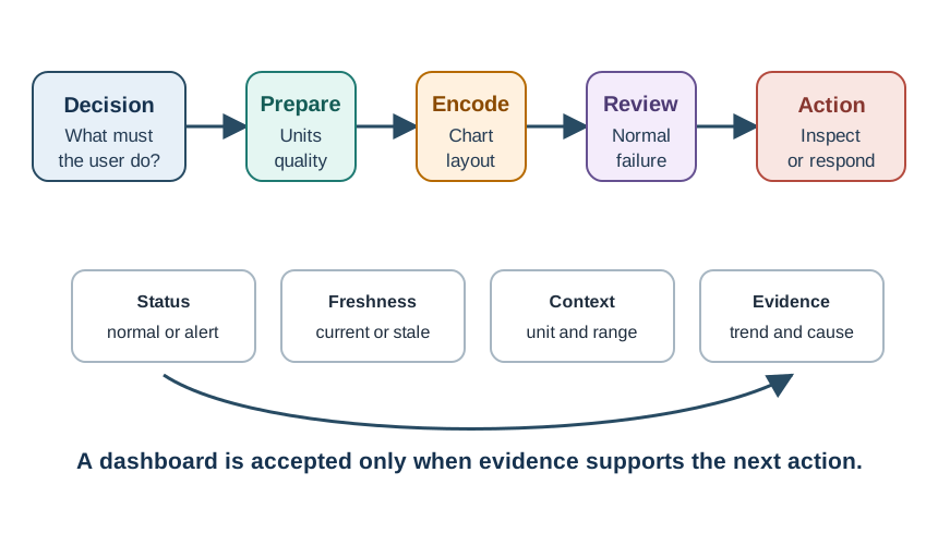
Use Figure 1 to check whether a dashboard has enough evidence to support action.
A reviewable visualization connects:
- the user decision;
- the telemetry source;
- the unit, threshold, expected range, and time window;
- the freshness and quality state;
- the chart, status tile, map, or dashboard layout;
- normal, abnormal, stale, missing, and recovery examples;
- the next action or drill-down path.
Before changing colors, animation, card treatments, or chart styling, verify that the page shows what the value measures, where the data came from, whether it is current enough to trust, and what the user should do next.
Dashboard Hierarchy
A dashboard page usually needs three layers.
Layer 1: overview. The overview answers the primary status question without forcing the user to scan dense tables or long trend history. It usually needs an overall state label, active alert count, affected site or device group, last update age, stale or missing-data state, one or two priority metrics, and a direct link to relevant detail.
Layer 2: explanation. The explanation shows why the overview says what it says. It can include recent trend, threshold or expected range, related devices or locations, event timeline, data-quality notes, and comparison with a normal period.
Layer 3: investigation. The investigation layer supports diagnosis, repair, and verification. It may include raw-versus-processed comparison, device and stream health, historical range, annotations, exportable evidence, and links to logs or configuration.
The layers can live on one page or across linked pages. What matters is that the user reaches the right level without fighting the layout.
Review Loop
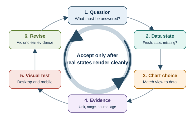
Use Figure 2 before accepting a visualization.
- Write the user question.
- Identify data state and update behavior.
- Choose the chart or status view.
- Add evidence such as units, freshness, thresholds, and missing-data state.
- Test desktop, mobile, normal, abnormal, stale, and missing cases.
- Revise until the question is answered clearly.
This process catches a common failure: the chart looks correct with one happy-path dataset but fails when the device is stale, the data is missing, the threshold changes, or the screen is narrow.
Freshness And Missing Data
IoT dashboards often mislead users by showing old values as if they were current.
Separate these states:
- Current: data arrived inside the expected update window.
- Stale: data is older than expected but still available.
- Missing: no usable value is available.
- Invalid: validation rejected the reading.
- Estimated: the system filled a gap using a rule or model.
- Offline: the device, gateway, stream, or service is not reachable.
Do not silently convert missing data to zero. Zero can be a real measurement: zero flow, zero occupancy, zero vibration, zero packets, or zero alerts. If the system did not receive a value, the dashboard should say so directly.
Practice Exercises
The former hands-on labs chapter is now folded into the survivor chapters as small exercises. Use the same lab packet format for each exercise:
- Decision question: what should the user learn or decide?
- Input signal: what sensor, simulator, or recorded values are used?
- Sampling rule: how often values are read and why?
- Encoding rule: how values become JSON, serial text, chart points, or state labels?
- Display rule: what appears first, what appears later, and what is hidden?
- Freshness rule: when a value becomes stale or missing?
- Failure case: what wrong behavior should the lab expose?
- Evidence record: screenshot, sample log, state transition, and interpretation notes.
Start with one controlled signal, prove the display, then add complexity. A working chart is only accepted when users can interpret current, stale, missing, warning, and critical states correctly.
Choose A Starting Point
Use these entry points when you already know what kind of review you need:
- To choose a chart or status view, use Visualization Types for IoT Data.
- To fix a crowded or unclear dashboard, use Dashboard Design Principles for IoT.
- To choose an implementation approach, use Visualization Tools.
- To review live update behavior, use Real-Time Visualization.
- To work with camera, audio, compressed media, telemetry schemas, or replay encodings, use Data Encoding and Codecs.
Study Questions
As you work through the module, keep asking:
- What decision does this visualization need to support?
- What data shape is being shown: status, trend, pattern, spatial state, comparison, composition, relationship, or distribution?
- What evidence tells the user whether the value is current, stale, missing, invalid, estimated, or offline?
- What context makes the value meaningful: unit, threshold, expected range, location, device group, or time window?
- What should the user inspect or do after seeing a warning or critical state?
- Does the page still work on mobile and on larger operational displays?
- What normal, abnormal, stale, and missing cases should be tested before acceptance?
Concept Relationships
- Visualization starts with the user question, not with a preferred chart.
- Dashboard hierarchy separates overview, explanation, and investigation.
- Chart selection depends on data shape, update behavior, audience, and required evidence.
- Real-time views need freshness rules, bounded history, readable update rates, and clear stale states.
- Tool choice should follow data source, user role, update need, review evidence, and maintenance constraints.
- Labs make visualization decisions testable by forcing the page through realistic data states.
What’s Next
Begin with Visualization Types for IoT Data, then use the route map above to choose the visualization chapter that matches your current evidence question.